ToggleGroup
Two-state Toggle button, and a joined group of them for one choice or several.
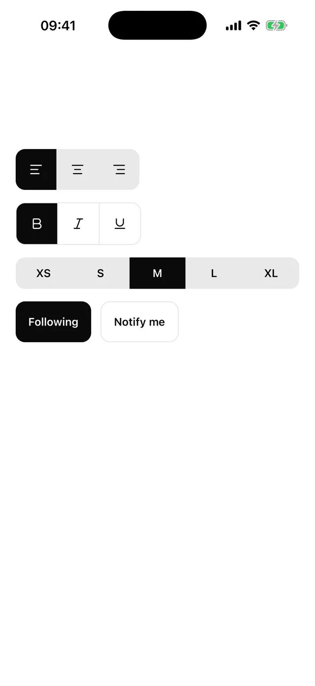
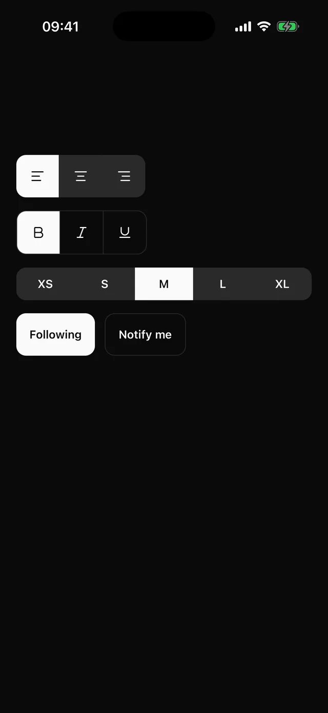
npx @eoria/cli add toggle-groupOne file holds both Toggle and ToggleGroup.
Usage
import { Toggle, ToggleGroup } from '@/components/ui/toggle-group'
<Toggle icon={<Bold />} accessibilityLabel="Bold" pressed={bold} onPressedChange={setBold} /><Toggle variant="outline" icon={<Star />} defaultPressed>  Favourite</Toggle>
<ToggleGroup value={align} onValueChange={setAlign} allowEmpty={false}>  <Toggle value="left" icon={<AlignLeft />} accessibilityLabel="Align left" />  <Toggle value="center" icon={<AlignCenter />} accessibilityLabel="Align centre" />  <Toggle value="right" icon={<AlignRight />} accessibilityLabel="Align right" /></ToggleGroup>
<ToggleGroup type="multiple" variant="outline" width="full" defaultValue={['s', 'm']}>  <Toggle value="s">S</Toggle>  <Toggle value="m">M</Toggle>  <Toggle value="l">L</Toggle></ToggleGroup>
Props
Toggle:
| Prop | Values | Default |
|---|---|---|
pressed |
boolean; controlled | |
defaultPressed |
boolean | false |
onPressedChange |
(pressed: boolean) => void |
|
variant |
default on muted, outline |
default |
size |
sm, md, lg, the heights of theme.control |
md |
icon |
any element accepting size and color |
|
children |
the label. A string gets the label style | |
value |
identifies the button inside a group | |
disabled |
boolean | false |
styles |
override root, rootPressed, rootDisabled, label, icon |
ToggleGroup:
| Prop | Single | Multiple |
|---|---|---|
type |
'single' (default) |
'multiple' |
value |
string | undefined |
string[] |
defaultValue |
string |
string[] |
onValueChange |
(value: string | undefined) => void |
(value: string[]) => void |
The group also takes variant, size, width of auto or full, allowEmpty, which defaults to true, disabled and styles for root, item, divider and rootDisabled. variant and size on the group apply to every Toggle in it. The value props follow Accordion. The group is controlled when the value key is present, even when it is undefined.
Notes
A pressed Toggle takes the foreground fill with background text, the same as a selected chip in Tabs. The state changes without animation and the button dims to 0.7 while touched.
In a group the buttons lose their own corners and borders. The group carries one theme.radius.control corner, clips its children and draws a 1pt border divider between them. width="full" stretches the group and shares the width between the buttons. With allowEmpty={false} the last pressed button stays pressed, which is what a text-alignment control wants.
Each Toggle has the togglebutton role and reports checked and disabled. An icon-only Toggle needs an accessibilityLabel. Controls under 44pt, which the dense presets have, get vertical hitSlop up to 44pt.