Input
Filled single-line text field with focus, invalid and disabled states.
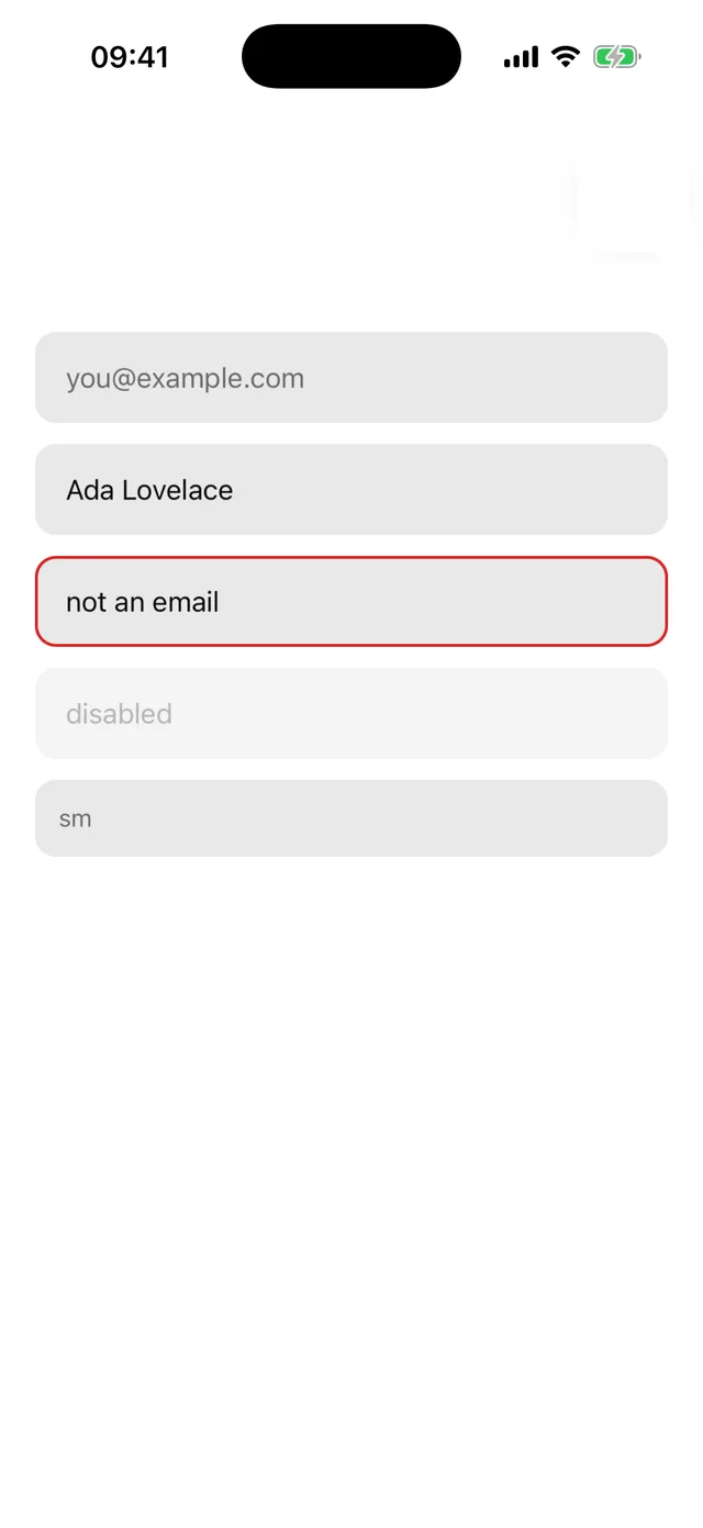
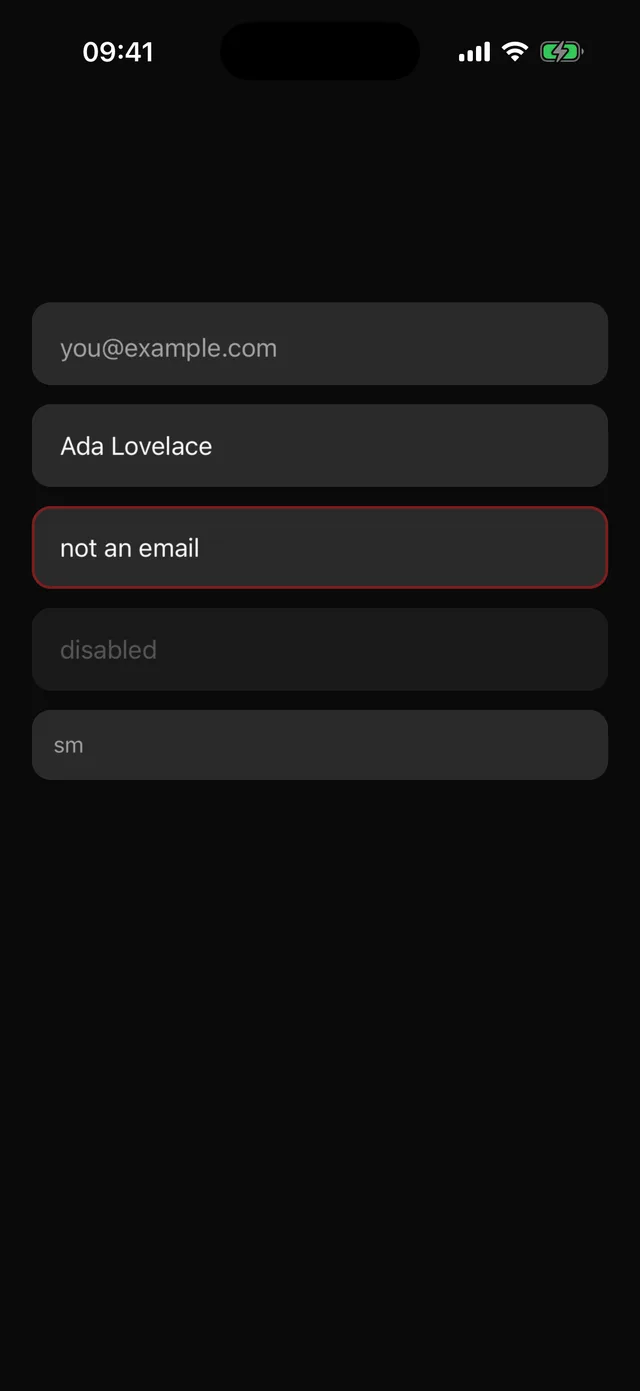
npx @eoria/cli add inputUsage
import { Input } from '@/components/ui/input'
<Input placeholder="[email protected]" keyboardType="email-address" value={email} onChangeText={setEmail} /><Input invalid placeholder="Required" /><Input disabled value="locked" />
Variants
| Prop | Values | Default |
|---|---|---|
size |
sm 44pt, md 52pt, lg 56pt |
md |
invalid |
boolean | false |
disabled |
boolean | false |
Focus is tracked internally and drives the ring colour. Every TextInput prop passes through.
Notes
- The frame is a 1.5pt transparent border over the
mutedfill, so the focus and error borders appear without a layout shift. placeholderTextColorandselectionColorcome from the theme.- Pair with Field for a label, description and error message wired for screen readers.