Select
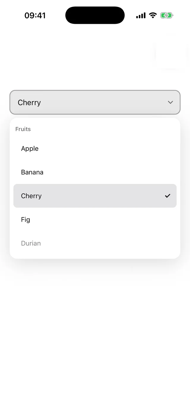
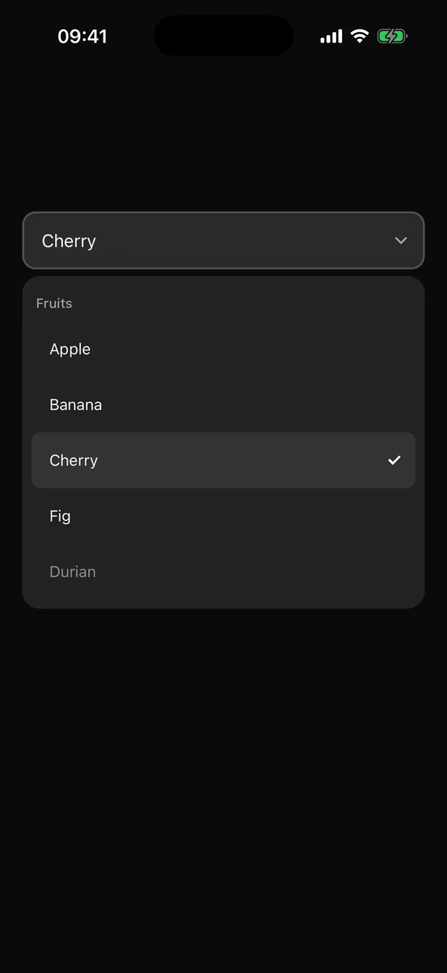
Anchored single-choice list with labelled options. Options carry their label.
npx @eoria/cli add selectUsage
import { Select, SelectContent, SelectItem, SelectTrigger, type SelectOption } from '@/components/ui/select'
const [country, setCountry] = useState<SelectOption | undefined>()
<Select value={country} onValueChange={setCountry}>  <SelectTrigger placeholder="Choose a country" />  <SelectContent>    <SelectItem value="pt" label="Portugal" />    <SelectItem value="es" label="Spain" />  </SelectContent></Select>
Why options are objects
Items only mount while the list is open, so a value alone cannot tell the trigger what to show. onValueChange receives { value, label } and value takes the same shape. Passing value={undefined} clears the selection; the component treats the presence of the value key as controlled.
Props
Select takes value, defaultValue, onValueChange, open, onOpenChange, size (sm, md, lg), invalid and disabled. SelectTrigger takes a placeholder or custom children. SelectContent takes side and align (default start). SelectContent accepts the Popper placement props and scrollProps. SelectItem takes value, label and disabled. SelectLabel is a group heading.
Notes
The trigger shares the Input frame, so the two line up in a form. The list matches the trigger width, sits on the elevated colour with a hairline, scrolls past 320pt, and closes on tap outside or Android back. The trigger has the combobox role and reports the selected label as its value; items use the option role.