Empty
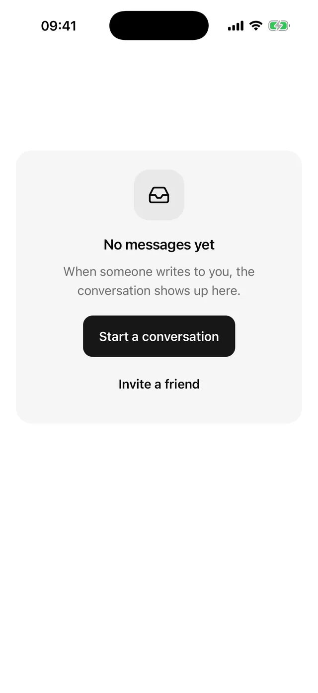
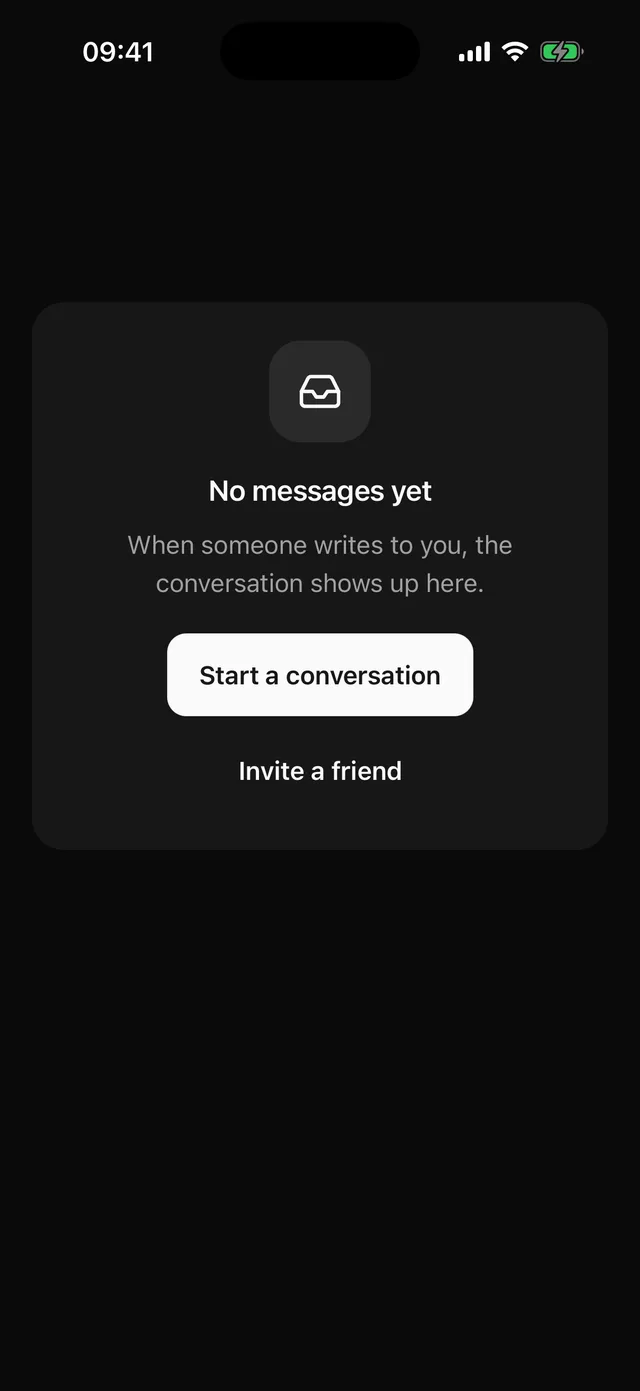
Centred empty state with media, a title, a description and actions.
npx @eoria/cli add emptyUsage
import {  Empty,  EmptyActions,  EmptyDescription,  EmptyMedia,  EmptyTitle,} from '@/components/ui/empty'import { Inbox } from 'lucide-react-native'
<Empty>  <EmptyMedia icon={<Inbox />} />  <EmptyTitle>No messages yet</EmptyTitle>  <EmptyDescription>When someone writes to you, the conversation shows up here.</EmptyDescription>  <EmptyActions>    <Button onPress={compose}>Start a conversation</Button>    <Button variant="ghost" onPress={invite}>Invite a friend</Button>  </EmptyActions></Empty>
Props
| Part | Props |
|---|---|
Empty |
any View prop, and styles for media, icon, title, description, actions |
EmptyMedia |
variant (icon default, plain), icon, children |
EmptyTitle |
any Text prop |
EmptyDescription |
any Text prop |
EmptyActions |
any View prop |
Notes
- The root uses
flexGrow: 1. In a parent with room, such as a screen, it fills the space and centres its content. Inside a Card or aScrollViewit keeps its own height.flex: 1would collapse to nothing there. EmptyMediawith theiconvariant is a 64pt well in themutedcolour with thetheme.radius.cardcorner, holding a 28pt icon. A pill preset turns the well into a near circle and a sharp preset squares it.plaindraws no well and sizes theiconat 48pt in the muted foreground. Pass an illustration or anImageas children instead oficonwhen you have one.- The media is hidden from screen readers.
EmptyTitlehas theheaderrole and carries the meaning. - Title and description stop at 300pt wide so lines stay short on a tablet. The title uses the heading font of the preset.
EmptyActionsstacks its buttons and centres them, primary first. Passstyle={{ flexDirection: 'row' }}for a pair side by side.