Image
expo-image in a frame that keeps its shape, fades the picture in and handles failure.
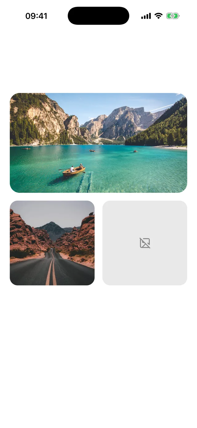
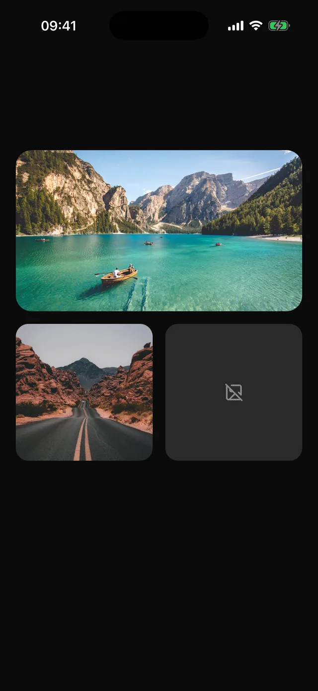
npx @eoria/cli add imageNeeds expo-image, a native module. Add it with npx expo install expo-image and rebuild the development build.
Usage
import { Image } from '@/components/ui/image'import { ImageOff } from 'lucide-react-native'
<Image source={trip.cover} alt="A lake between mountains" ratio={16 / 9} rounded="card" />
<Image  source={user.photo}  alt={user.name}  ratio={1}  rounded="full"  placeholder={{ blurhash: user.blurhash }}  fallback={<ImageOff size={20} color={theme.colors.mutedForeground} />}  style={{ width: 72 }}/>
Props
| Prop | Values | Default |
|---|---|---|
source |
URL string, require(), or an expo-image source |
|
alt |
text for screen readers | |
ratio |
width divided by height | |
rounded |
none, sm, md, lg, card, full |
none |
fallback |
node shown when loading fails | |
transition |
fade in, in ms | 150 |
contentFit |
expo-image fit | cover |
style |
style of the frame, where width and height go | |
styles |
override image, fallback |
Every other expo-image prop passes through, including placeholder, cachePolicy, priority and recyclingKey.
Notes
The frame takes its size from ratio and a width, so a list does not jump when pictures arrive. It is filled with muted until then. A failed load keeps the frame and shows fallback in place of a broken picture.
rounded="card" follows the card corner of the active preset, so a cover image matches the Card it sits in. Without alt the image is hidden from screen readers, which is right for decoration and wrong for content. In a recycled list, pass recyclingKey so a reused cell does not flash the previous picture.
Avatar still uses the React Native image and needs no native module. Use Image for content pictures.