Text
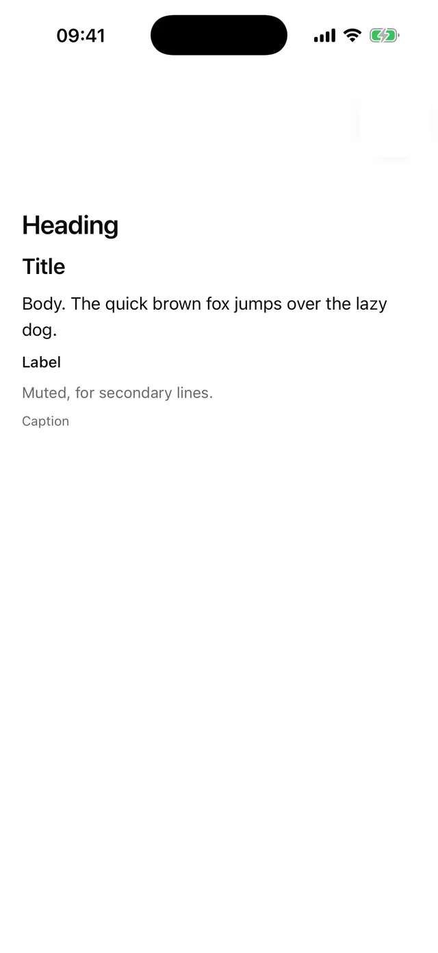
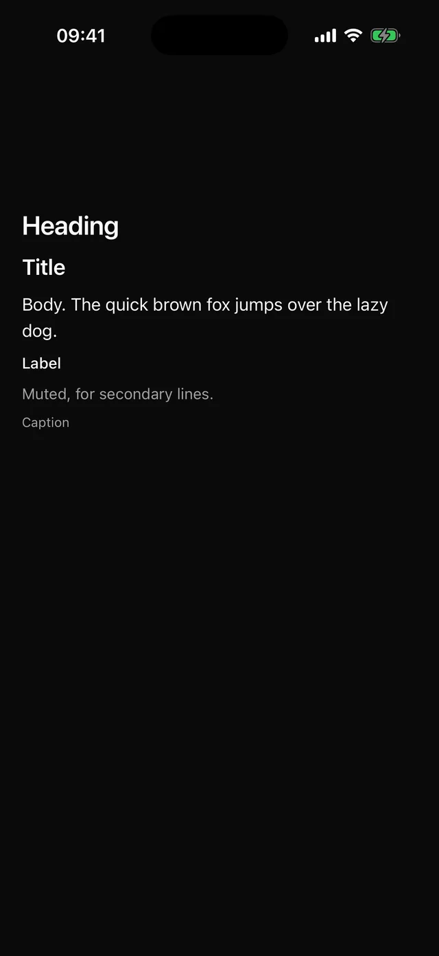
Themed text with typography variants and capped dynamic type.
npx @eoria/cli add textUsage
import { Text } from '@/components/ui/text'
<Text variant="heading">Welcome back</Text><Text variant="muted">Sign in to continue.</Text><Text weight="semibold">12.4k</Text>
Variants
| Prop | Values | Default |
|---|---|---|
variant |
body, muted, caption, label, title, heading |
body |
weight |
normal, medium, semibold, bold |
unset |
Notes
- The plain
styleprop is accepted and merged after the recipe, because Text has a single slot. maxFontSizeMultiplierdefaults to 1.5 so dynamic type cannot break layouts. Raise it where the layout can take it.suppressHighlightingdefaults to true. Without it iOS draws a grey box behind pressable text.- Almost every other component depends on Text, which is why it is the first thing the CLI copies.