Card
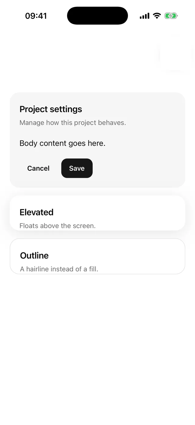
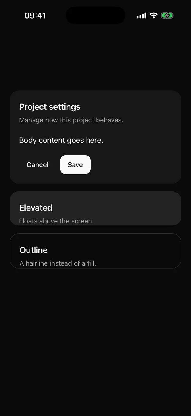
Surface tile with header, content and footer. Filled by default, no hairline border.
npx @eoria/cli add cardUsage
import { Card, CardContent, CardDescription, CardHeader, CardTitle } from '@/components/ui/card'
<Card>  <CardHeader>    <CardTitle>Shipping</CardTitle>    <CardDescription>Arrives in 2 to 5 days.</CardDescription>  </CardHeader>  <CardContent>…</CardContent></Card>
<Card variant="elevated" onPress={open} accessibilityLabel="Open profile">…</Card>
Variants
| Value | Look |
|---|---|
filled |
surface fill, radius 20. Default. |
elevated |
elevated fill on a soft shadow. Floats on the page. |
outline |
Screen background with a 1pt border. The quiet one. |
Notes
- With
onPressoronLongPressthe root becomes a Pressable with a press state. Give it anaccessibilityLabel; Pressable flattens the children for screen readers. - Controls inside a card use
muted, one step darker thansurface, so they keep their fill. elevateddoes not clip its children, becauseoverflow: hiddenwould clip the shadow on iOS. Round an image yourself if it touches the edge.