Dialog
Bottom sheet by default with a grabber, or a centred card. Portalled above navigation.
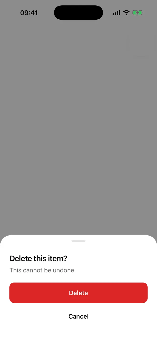
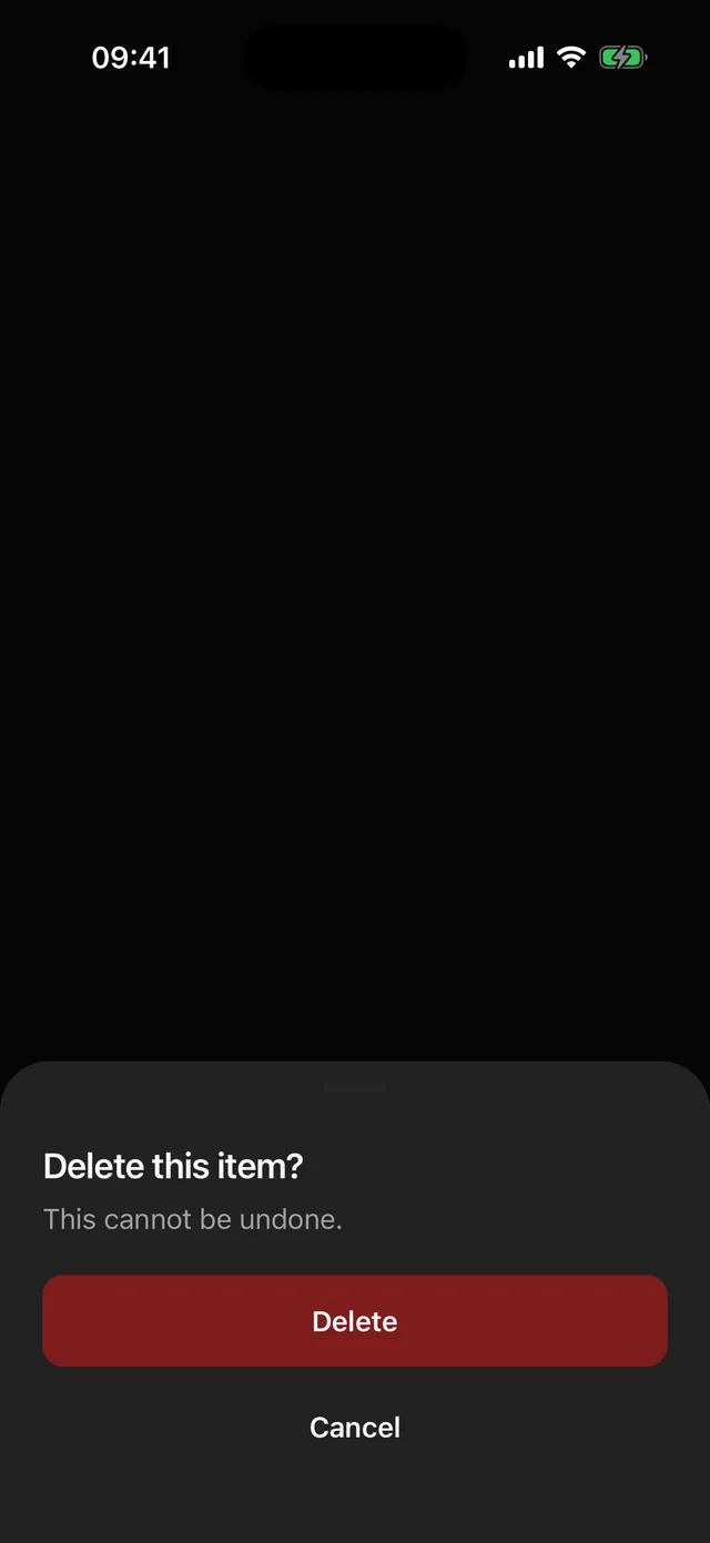
npx @eoria/cli add dialogUsage
import {  Dialog,  DialogClose,  DialogContent,  DialogDescription,  DialogFooter,  DialogHeader,  DialogTitle,  DialogTrigger,} from '@/components/ui/dialog'
<Dialog>  <DialogTrigger asChild>    <Button variant="destructive">Delete account</Button>  </DialogTrigger>  <DialogContent>    <DialogHeader>      <DialogTitle>Delete your account?</DialogTitle>      <DialogDescription>This cannot be undone.</DialogDescription>    </DialogHeader>    <DialogFooter>      <DialogClose asChild>        <Button variant="destructive" width="full" onPress={remove}>          Delete        </Button>      </DialogClose>      <DialogClose asChild>        <Button variant="ghost" width="full">          Keep account        </Button>      </DialogClose>    </DialogFooter>  </DialogContent></Dialog>
Props
Dialog takes open, defaultOpen, onOpenChange and placement (bottom default, center). DialogContent takes dismissable (tap outside closes, default true). Trigger and Close accept asChild to inject onPress into a single child.
Notes
- The footer stacks actions full width, primary first, which is the pattern on phones. Center placement keeps the same order.
- Bottom placement slides 24pt and fades in 120 ms. Center scales from 0.97. No springs.
- Android back closes it. The overlay is a “Close dialog” button for TalkBack; on iOS the portal host is marked modal so VoiceOver stays inside.
- Context does not cross the portal, so
DialogContentre-provides it. If you build your own portal content, do the same. - For draggable sheets with snap points, a separate
sheetitem wrapping@gorhom/bottom-sheetis planned. Dialog stays dependency-free.