Swipeable
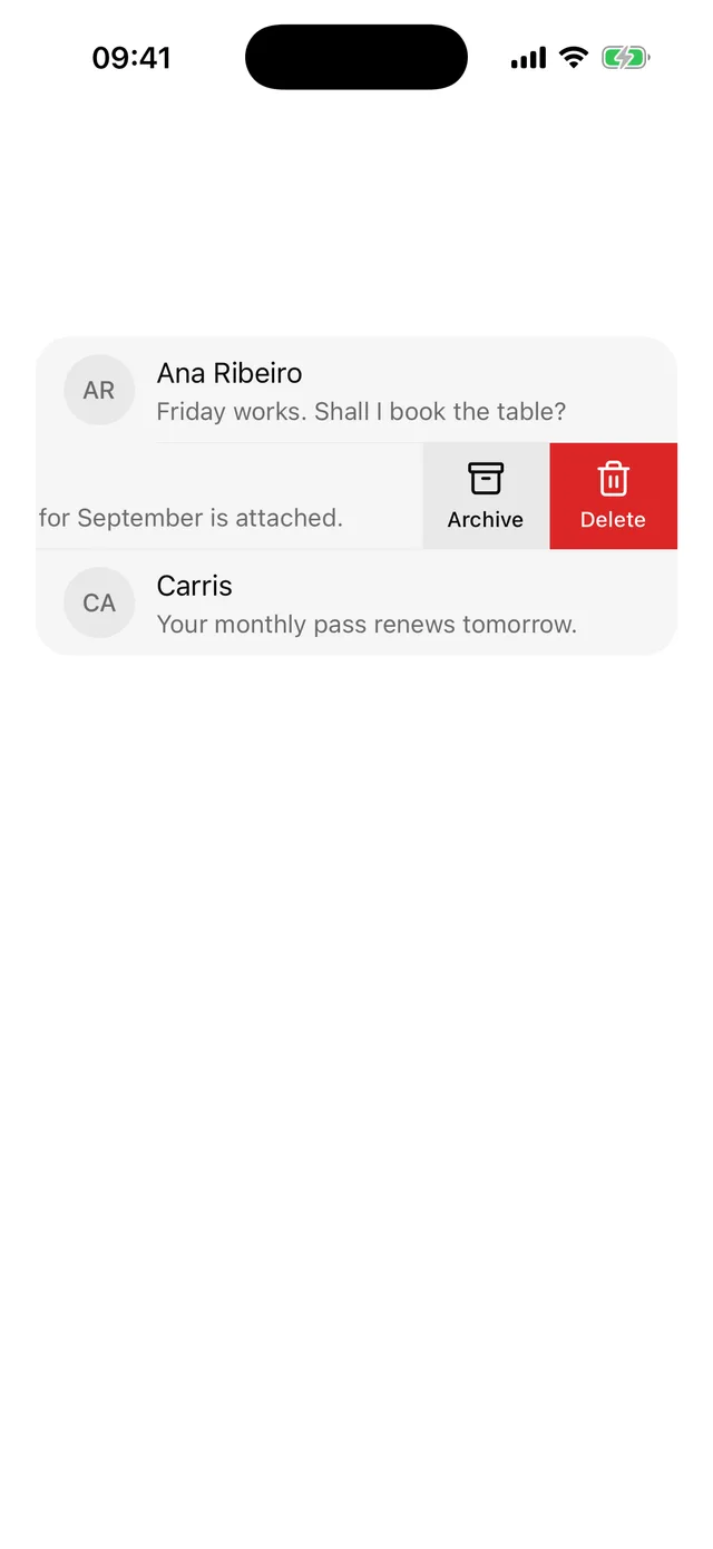
Row that slides to show leading and trailing actions, with the same actions offered to screen readers.
npx @eoria/cli add swipeableNeeds react-native-gesture-handler and a GestureHandlerRootView around the app, which Expo Router projects usually already have. The CLI installs the package as a dependency of the item.
Usage
import { Swipeable, SwipeableAction } from '@/components/ui/swipeable'
<ItemGroup>  {messages.map((m) => (    <Swipeable      key={m.id}      leading={        <SwipeableAction variant="primary" icon={<MailOpen />} onPress={() => markRead(m.id)}>          Read        </SwipeableAction>      }      trailing={        <>          <SwipeableAction icon={<Archive />} onPress={() => archive(m.id)}>            Archive          </SwipeableAction>          <SwipeableAction variant="destructive" icon={<Trash2 />} onPress={() => remove(m.id)}>            Delete          </SwipeableAction>        </>      }    >      <Item onPress={() => open(m.id)}>        <ItemContent>          <ItemTitle>{m.from}</ItemTitle>          <ItemDescription>{m.subject}</ItemDescription>        </ItemContent>      </Item>    </Swipeable>  ))}</ItemGroup>
Close a row from code through the ref.
const row = useRef<SwipeableRef>(null)
<Swipeable ref={row} trailing={…}>…</Swipeable>
row.current?.close()
Props
| Prop | Values | Default |
|---|---|---|
leading |
actions under the start of the row | |
trailing |
actions under the end of the row | |
onOpen |
(side: 'leading' | 'trailing') => void, after the row settles open |
|
onClose |
fires after the row settles closed | |
threshold |
points the row has to travel to open on release | 40 |
disabled |
turns the gesture off | false |
styles |
override root, content, actions |
|
ref |
close(), openLeading(), openTrailing() |
SwipeableAction:
| Prop | Values | Default |
|---|---|---|
variant |
default on muted, primary, destructive |
default |
icon |
any element accepting size and color |
|
children |
the label under the icon | |
onPress |
() => void. Takes no event, a screen reader also calls it |
|
closeOnPress |
close the row after the press | true |
disabled |
boolean | false |
styles |
override root, rootPressed, rootDisabled, label, icon |
Notes
An action is theme.control.lg plus 16pt wide, 72pt on the default preset, and stretches to the height of the row. Several actions on one side render in source order.
The row follows the finger one to one. Past the width of the actions it resists with a friction of 8. On release it opens after 40pt of travel, and a tap on an open row closes it. The settle animation belongs to gesture-handler. It is a spring with clamped overshoot and heavy damping, so the row does not bounce. Under the OS reduce-motion setting the row jumps to its end state.
A closed row only claims a drag towards a side that has actions. A row with trailing alone leaves a drag to the right to the navigation stack, so swipe-back still works over the list.
The actions sit under the row, so the sliding part needs a fill. The content slot uses background. An Item inside an ItemGroup paints the group fill over it and the group clips the corners, so that pairing needs no overrides. On any other surface set styles.content.
Screen-reader users cannot swipe. Each action with a label registers with the Swipeable, which passes them to its child as accessibilityActions. VoiceOver lists them in the Actions rotor and TalkBack in its actions menu. The child has to be one element that accepts those props and is accessible, such as a pressable Item. An Item without onPress turns itself into one accessible element when it receives actions. The action panels are hidden from the accessibility tree, since they sit under the row where focus could still reach them. An action without a string label needs an accessibilityLabel or it is left out.
leading and trailing follow the reading direction. In right-to-left layouts they swap sides.