Alert
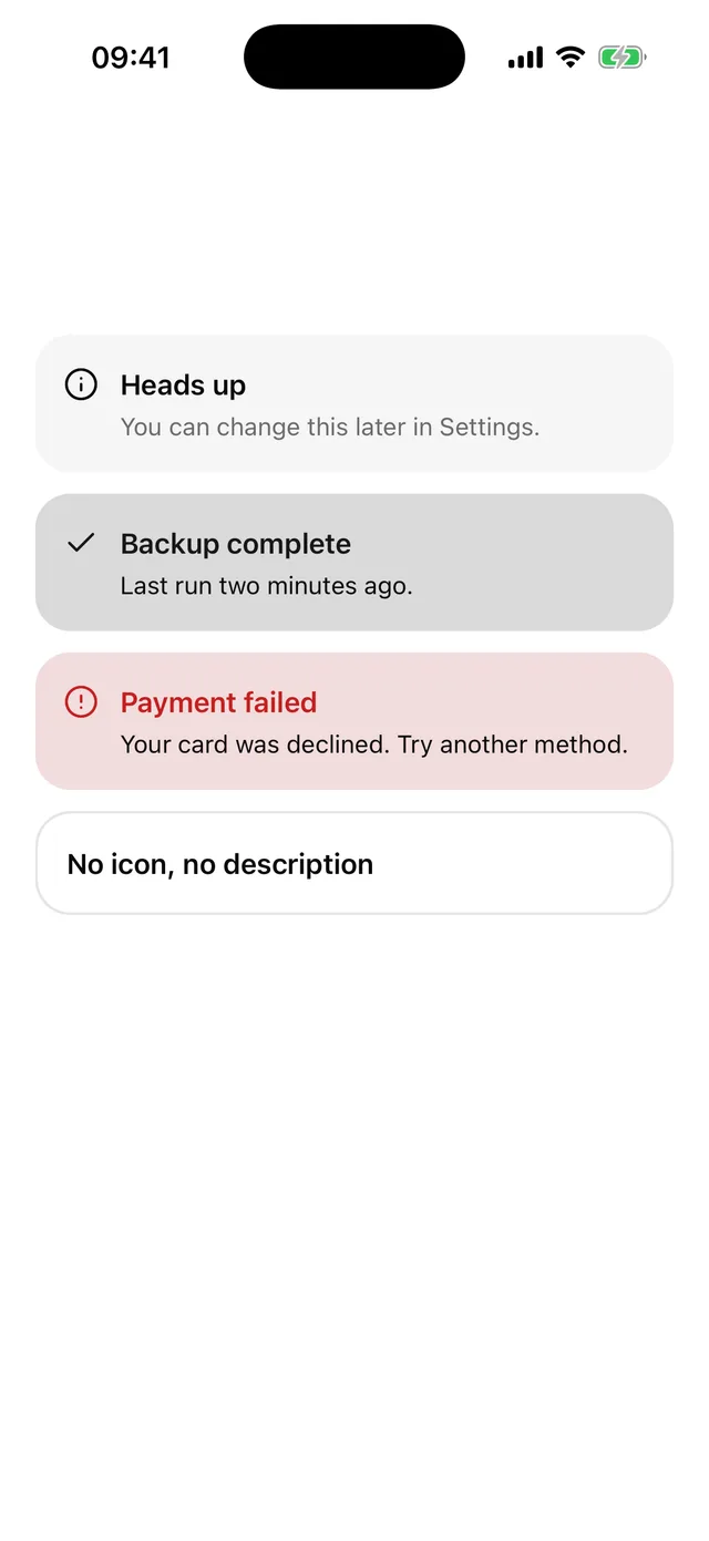
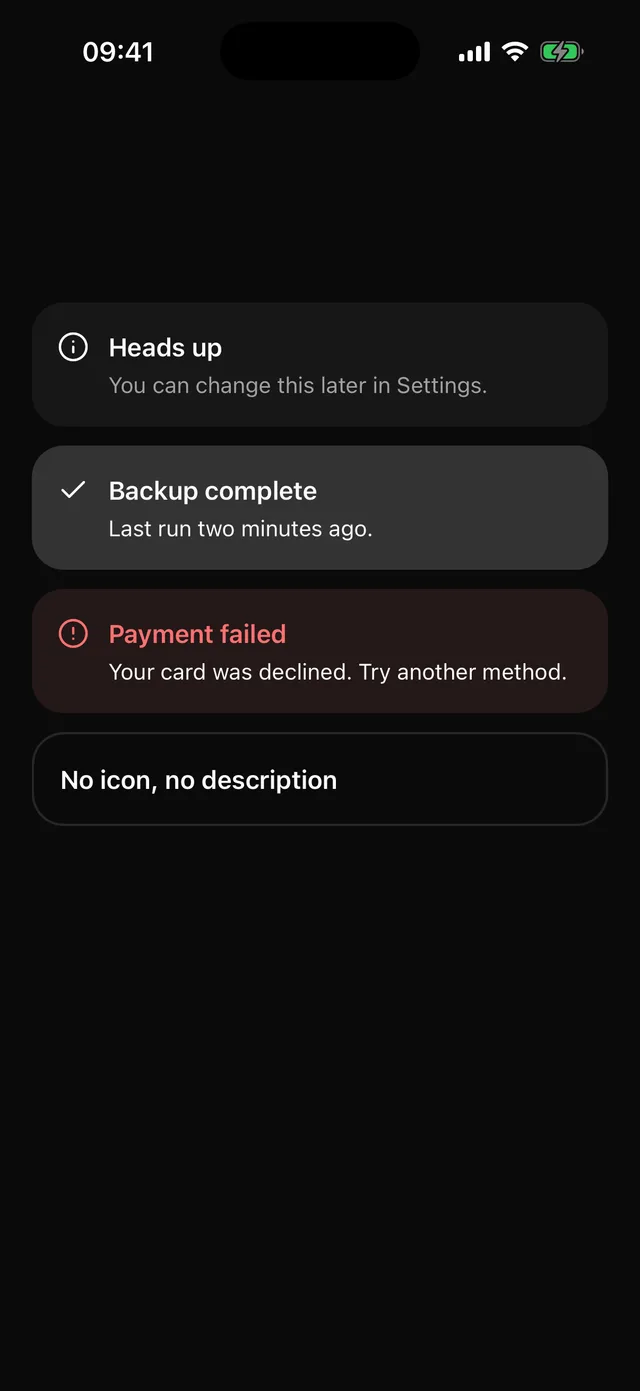
Inline banner with an icon, a title and a description. Tinted variants keep text at full contrast.
npx @eoria/cli add alertUsage
import { AlertCircle, Info } from 'lucide-react-native'import { Alert, AlertDescription, AlertTitle } from '@/components/ui/alert'
<Alert icon={<Info />}>  <AlertTitle>Heads up</AlertTitle>  <AlertDescription>You can change this later in Settings.</AlertDescription></Alert>
<Alert variant="destructive" icon={<AlertCircle />}>  <AlertTitle>Payment failed</AlertTitle>  <AlertDescription>Your card was declined. Try another method.</AlertDescription></Alert>
Props
| Prop | Values | Default |
|---|---|---|
variant |
default, primary, destructive, outline |
default |
icon |
element taking size and color, e.g. lucide |
|
styles |
overrides for tint, icon, body, title, description |
AlertTitle and AlertDescription are Text with the matching slot style. Only the title is expected; the description and icon are optional and the layout does not shift without them.
Notes
default sits on the surface colour without a hairline, like a Card. primary and destructive lay a 12 percent wash of that colour over the surface through the tint slot and colour the icon and title, so the body text stays readable on any preset. The root is one accessible element with the alert role, so a screen reader announces title and description together.