DropdownMenu
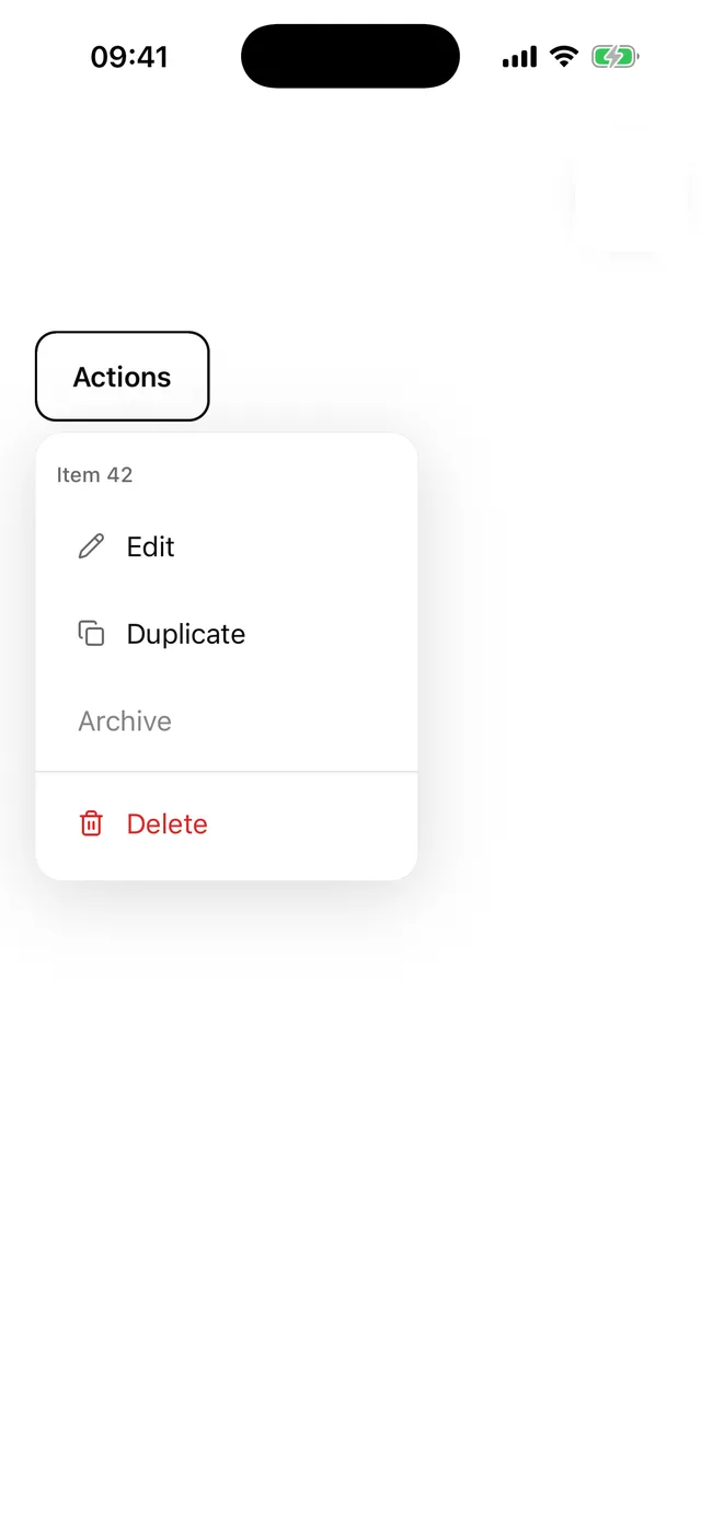
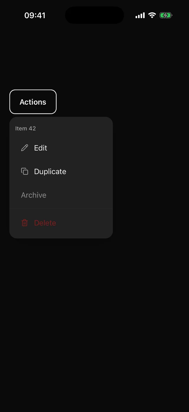
Anchored menu with items, labels, separators and icons.
npx @eoria/cli add dropdown-menuUsage
import {  DropdownMenu,  DropdownMenuContent,  DropdownMenuItem,  DropdownMenuLabel,  DropdownMenuSeparator,  DropdownMenuTrigger,} from '@/components/ui/dropdown-menu'
<DropdownMenu>  <DropdownMenuTrigger asChild>    <Button variant="ghost" size="icon" icon={<MoreHorizontal />} accessibilityLabel="More" />  </DropdownMenuTrigger>  <DropdownMenuContent align="end">    <DropdownMenuLabel>Item 42</DropdownMenuLabel>    <DropdownMenuItem icon={<Pencil />} onSelect={edit}>      Edit    </DropdownMenuItem>    <DropdownMenuSeparator />    <DropdownMenuItem destructive icon={<Trash2 />} onSelect={remove}>      Delete    </DropdownMenuItem>  </DropdownMenuContent></DropdownMenu>
Props
DropdownMenuItem takes onSelect, closeOnSelect (default true), destructive, disabled and icon. The icon adapter reads the icon slot the same way Button does. Content accepts the Popper placement props, with align defaulting to start instead of center.
Rows are 50pt with a 16pt label. The menu sits on the elevated colour with a hairline and a soft shadow, and closes on tap outside or Android back.