Button
Pressable with variant, size and width, an icon slot, and a press that scales instead of fading.
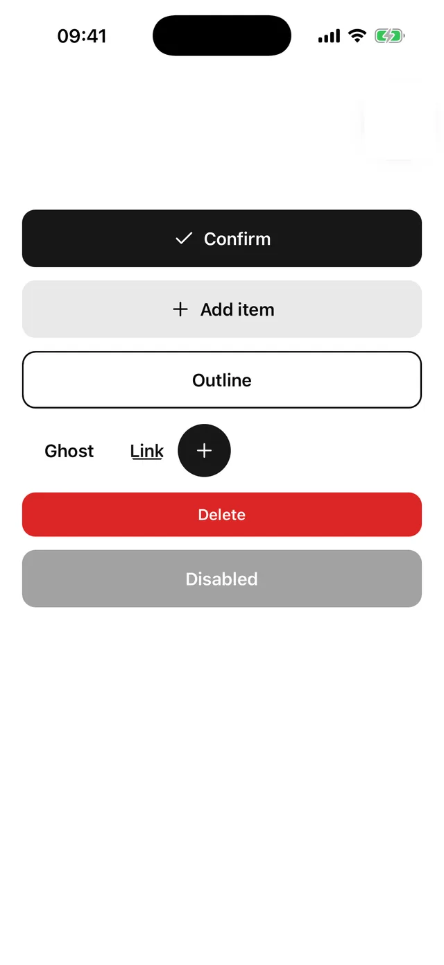
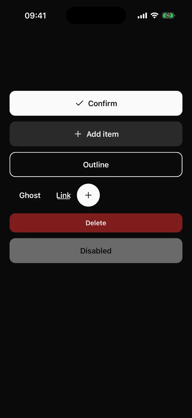
npx @eoria/cli add buttonUsage
import { Button } from '@/components/ui/button'import { Plus } from 'lucide-react-native'
<Button width="full" onPress={save}>Save changes</Button><Button variant="secondary" icon={<Plus />}>Add item</Button><Button variant="outline" size="sm">Edit</Button><Button variant="link" size="sm">Forgot?</Button><Button size="icon" icon={<Plus />} accessibilityLabel="Add" />
Variants
| Prop | Values | Default |
|---|---|---|
variant |
default, secondary, outline, ghost, destructive, link |
default |
size |
sm 40pt, md 52pt, lg 56pt, icon 48pt circle |
md |
width |
auto, full |
auto |
Props
| Prop | Type |
|---|---|
icon |
element accepting size and color |
iconPosition |
left, right |
styles |
overrides for label, icon, rootPressed, rootDisabled |
disabled |
boolean, also sets accessibility state |
style is not accepted. Use styles={{ root: … }} so overrides go through the recipe.
Press feedback
On press the button scales to 0.97 over 90 ms and a tint layer appears over the fill. The tint is the foreground colour at 8% opacity, or the label colour at 16% on filled variants, so it reads on every theme and preset.
Deriving a button
createButton(recipe) builds a new component from any recipe that keeps the label, icon, rootPressed and rootDisabled slots. This is what the planned eoria extend button command will generate.
export const checkoutButtonRecipe = extendSlotRecipe(buttonRecipe, (theme) => ({ slots: { root: { borderRadius: theme.radius.full } }, variants: { variant: { brand: { root: { backgroundColor: '#7c3aed' } } } }, defaultVariants: { variant: 'brand', size: 'lg' },}))export const CheckoutButton = createButton(checkoutButtonRecipe)The icon adapter reads width and color from the icon slot and passes them as size and color, so it works with lucide and anything with the same props.