PasswordInput
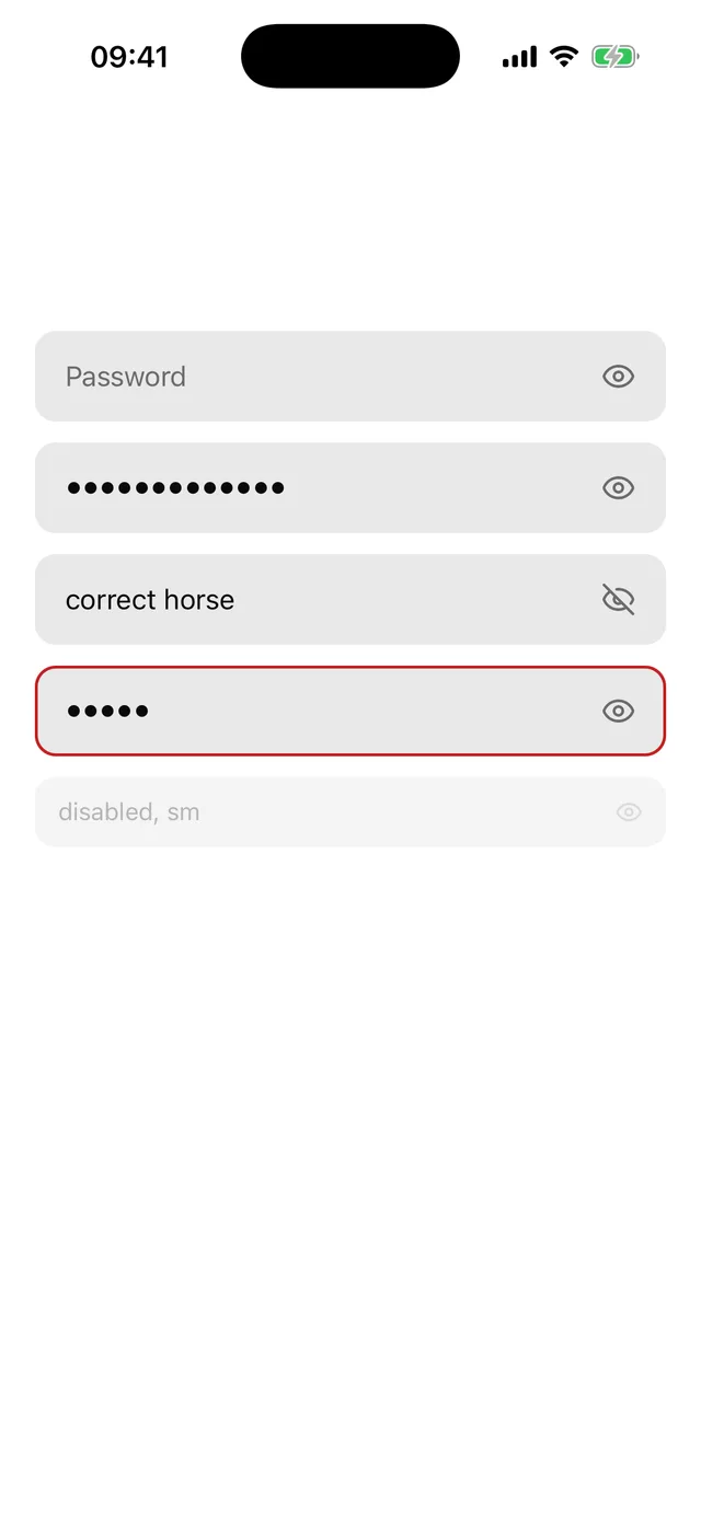
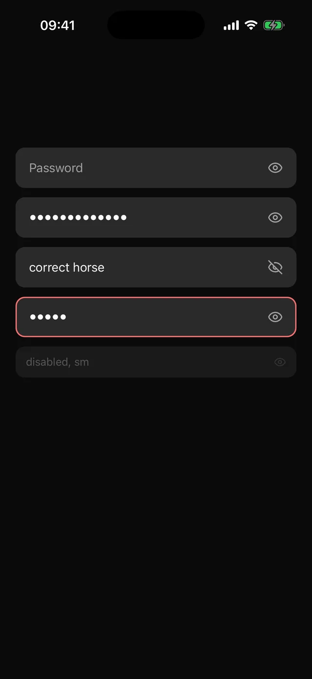
Secure text field with a reveal toggle and password autofill hints.
npx @eoria/cli add password-inputUsage
import { PasswordInput } from '@/components/ui/password-input'
<PasswordInput placeholder="Password" value={password} onChangeText={setPassword} />
<PasswordInput  placeholder="New password"  autoComplete="new-password"  textContentType="newPassword"  invalid={tooShort}/>
Props
| Prop | Values | Default |
|---|---|---|
size |
sm, md, lg |
md |
invalid |
boolean | false |
disabled |
boolean | false |
visible |
boolean, controls the reveal state | |
defaultVisible |
boolean | false |
onVisibleChange |
(visible: boolean) => void |
|
showLabel, hideLabel |
strings read out for the toggle | Show password, Hide password |
styles, style |
go to the InputGroup frame |
Every other TextInput prop passes through to the field, and the ref points at the TextInput. secureTextEntry is not accepted because the toggle owns it.
Notes
- The defaults are
textContentType="password",autoComplete="current-password",autoCapitalize="none",autoCorrect={false}andspellCheck={false}. They suit a sign-in form. On a sign-up form passautoComplete="new-password"andtextContentType="newPassword"so the system offers a generated password. - The toggle shows an eye while the password is hidden and a crossed eye while it shows. Its label follows, “Show password” then “Hide password”, so the icon and the label both name what a press does. It is a
buttonthat reportsdisabled. It does not also reportselected, because a flipping label plus a state reads twice in VoiceOver. - iOS clears a secure field on the first keystroke after it regains focus, and after the password is hidden again. That is system behaviour, not the component.
- PasswordInput has no recipe of its own. It is an InputGroup with an end addon, so it matches Input and follows local edits to either file.
- It works as the child of
FieldControl.invalidanddisabledreach the frame and the accessibility props reach the field.