IconButton
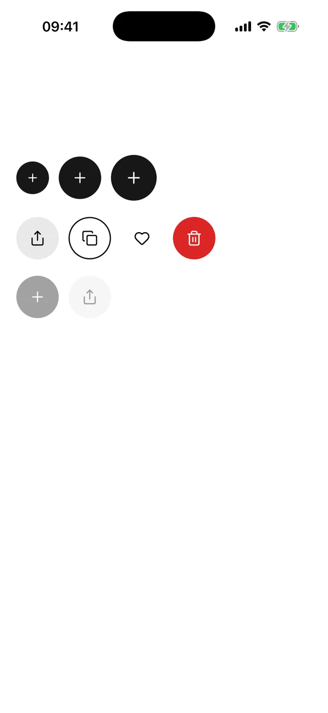
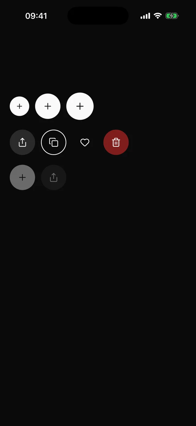
Round icon-only button. Same variants and press as Button, and the type requires a label.
npx @eoria/cli add icon-buttonUsage
import { IconButton } from '@/components/ui/icon-button'import { Heart, Plus, Share } from 'lucide-react-native'
<IconButton icon={<Plus />} accessibilityLabel="Add item" onPress={add} /><IconButton variant="secondary" size="sm" icon={<Share />} accessibilityLabel="Share" /><IconButton variant="ghost" icon={<Heart />} accessibilityLabel="Save to favourites" />
Variants
| Prop | Values | Default |
|---|---|---|
variant |
default, secondary, outline, ghost, destructive, link |
default |
size |
sm 40pt, md 52pt, lg 56pt |
md |
Props
| Prop | Type |
|---|---|
icon |
element accepting size and color, required |
accessibilityLabel |
string, required |
styles |
overrides for label, icon, rootPressed, rootDisabled |
disabled |
boolean, also sets accessibility state |
hitSlop |
replaces the computed slop |
Every other Pressable prop passes through. style is not accepted. Use styles={{ root: … }} so overrides go through the recipe.
Notes
- The recipe extends the Button recipe, so variants, the 0.97 press scale, the tint layer and the icon sizes (16, 20 and 22pt) follow any local edit to Button.
- Each size is a circle as tall as the Button and Input of the same size. An IconButton next to an
mdInput lines up with it. The sizes come fromtheme.control, so they change with the preset. - Omitting
accessibilityLabelis a type error. A screen reader has nothing else to read on a button with no text. - When a preset makes a size shorter than 44pt, the component adds
hitSlopto bring the touch target back to 44pt. - Button still has
size="icon"for a one-off. Use IconButton when you want the three sizes and the required label.