ActionSheet
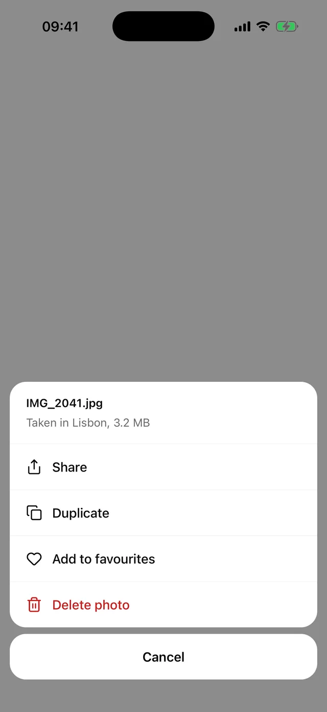
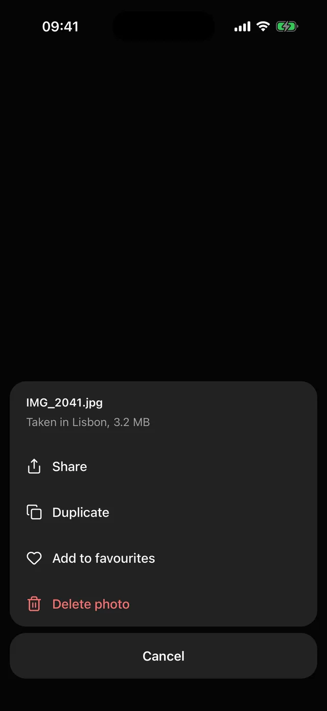
Bottom sheet of actions with icons, a destructive variant and a separate Cancel block, as on iOS.
npx @eoria/cli add action-sheetUsage
import {  ActionSheet,  ActionSheetCancel,  ActionSheetContent,  ActionSheetHeader,  ActionSheetItem,  ActionSheetTrigger,} from '@/components/ui/action-sheet'import { Copy, Share, Trash2 } from 'lucide-react-native'
<ActionSheet>  <ActionSheetTrigger asChild>    <Button variant="outline">Photo options</Button>  </ActionSheetTrigger>  <ActionSheetContent>    <ActionSheetHeader title="IMG_2041.jpg" message="Taken in Lisbon, 3.2 MB" />    <ActionSheetItem icon={<Share />} onSelect={share}>      Share    </ActionSheetItem>    <ActionSheetItem icon={<Copy />} onSelect={duplicate}>      Duplicate    </ActionSheetItem>    <ActionSheetItem variant="destructive" icon={<Trash2 />} onSelect={remove}>      Delete photo    </ActionSheetItem>    <ActionSheetCancel />  </ActionSheetContent></ActionSheet>
Props
| Part | Props |
|---|---|
ActionSheet |
open, defaultOpen, onOpenChange, styles |
ActionSheetTrigger |
asChild injects onPress into a single child |
ActionSheetContent |
dismissable (default true), closeLabel for the overlay (default Close dialog) and any View prop |
ActionSheetHeader |
title, message. Both optional |
ActionSheetItem |
onSelect, closeOnSelect (default true), variant (default, destructive), icon, disabled |
ActionSheetCancel |
children (default Cancel) and any Pressable prop |
styles takes the Dialog slots plus group, list, listContent, item, itemPressed, itemDisabled, itemLabel, itemLabelDestructive, icon, iconDestructive, cancel, cancelPressed and cancelLabel.
Notes
- The recipe extends the Dialog recipe with bottom placement. The sheet surface turns transparent and two blocks float on the overlay, one with the header and rows and one with Cancel. The 24pt slide, the overlay tap and Android back are Dialog’s.
ActionSheetContentfindsActionSheetHeaderandActionSheetCancelamong its direct children and places them. A Cancel wrapped in your own component lands among the rows, so keep it a direct child.- Rows are
theme.control.lgtall with a 16pt medium label. Labels are leading-aligned, not centred as on iOS. With icons in the rows, leading alignment puts the icons in one column and starts every label at the same x, and a long label truncates at the end instead of pushing its icon around. It is also how Android bottom sheets and the DropdownMenu rows read. Cancel has no icon, so its label stays centred. - The separators are the
groupfill showing through a hairline gap. No row needs to know whether it is first or last. - When the rows do not fit, the list scrolls between a pinned header and the Cancel block.
- A pressed row takes the
accentfill, the same as DropdownMenu. Rows have themenuitemrole and reportdisabled. - For a short menu anchored to a button, use DropdownMenu. The sheet suits one-handed reach and destructive choices.