Popover
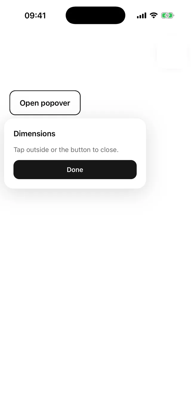
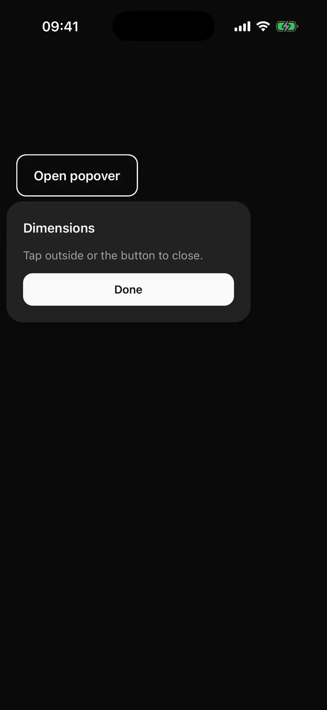
Anchored card with a title and description, dismissed by tapping outside.
npx @eoria/cli add popoverUsage
import {  Popover,  PopoverClose,  PopoverContent,  PopoverDescription,  PopoverTitle,  PopoverTrigger,} from '@/components/ui/popover'
<Popover>  <PopoverTrigger asChild>    <Button variant="outline">Details</Button>  </PopoverTrigger>  <PopoverContent side="top" align="end">    <PopoverTitle>Dimensions</PopoverTitle>    <PopoverDescription>Flips to the bottom when there is no room above.</PopoverDescription>    <PopoverClose asChild>      <Button size="sm">Done</Button>    </PopoverClose>  </PopoverContent></Popover>
Props
Popover takes open, defaultOpen and onOpenChange. PopoverContent takes the Popper placement props plus dismissable. PopoverTrigger takes asChild and anchorStyle for the measured wrapper.
With asChild the trigger also injects accessibilityState.expanded into the child.