Checkbox
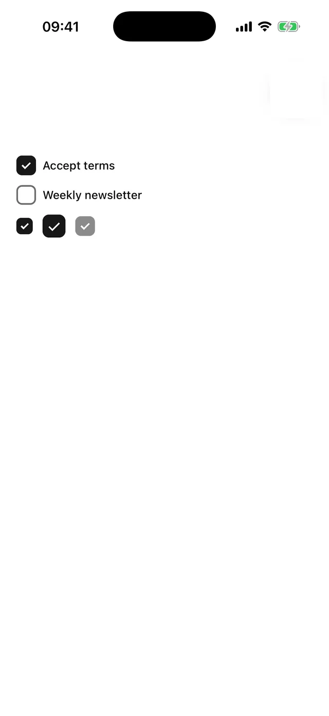
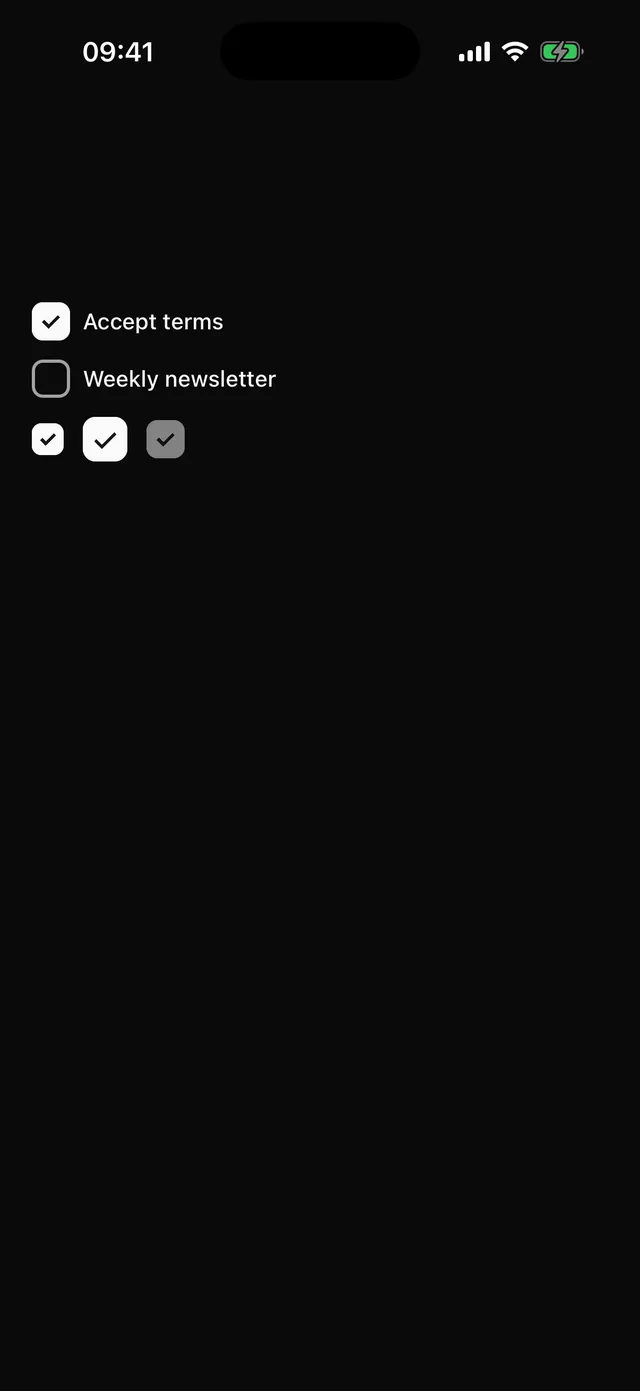
Rounded square toggle with a drawn check mark, no icon dependency.
npx @eoria/cli add checkboxUsage
import { Checkbox } from '@/components/ui/checkbox'
<HStack gap={2}>  <Checkbox checked={agree} onCheckedChange={setAgree} accessibilityLabel="Accept terms" />  <Label onPress={() => setAgree((a) => !a)}>Accept terms</Label></HStack>
Props
| Prop | Values | Default |
|---|---|---|
checked |
boolean, required | |
onCheckedChange |
(checked: boolean) => void |
|
size |
sm 20, md 24, lg 28 |
md |
disabled |
boolean |
Controlled only. The check mark is two borders rotated 45 degrees and scales in over 120 ms. hitSlop defaults to 8.