InputGroup
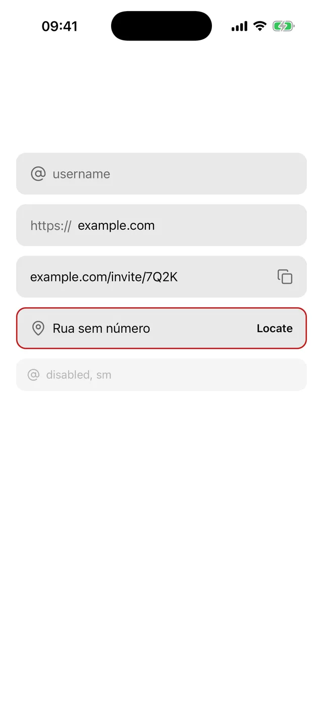
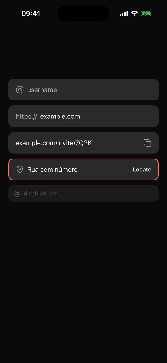
The Input frame around a text field plus icons, text and buttons inside it.
npx @eoria/cli add input-groupUsage
import {  InputGroup,  InputGroupAddon,  InputGroupButton,  InputGroupInput,} from '@/components/ui/input-group'import { AtSign, Copy } from 'lucide-react-native'
<InputGroup>  <InputGroupAddon icon={<AtSign />} />  <InputGroupInput placeholder="username" autoCapitalize="none" /></InputGroup>
<InputGroup>  <InputGroupAddon>https://</InputGroupAddon>  <InputGroupInput placeholder="example.com" keyboardType="url" /></InputGroup>
<InputGroup invalid>  <InputGroupInput value={link} onChangeText={setLink} />  <InputGroupAddon align="end">    <InputGroupButton icon={<Copy />} accessibilityLabel="Copy link" onPress={copy} />  </InputGroupAddon></InputGroup>
Props
InputGroup
| Prop | Values | Default |
|---|---|---|
size |
sm 40pt, md 52pt, lg 56pt |
md |
invalid |
boolean | false |
disabled |
boolean | false |
styles |
overrides for the slots below |
InputGroupInput takes every TextInput prop except editable, which the group’s disabled sets. It forwards its ref to the TextInput.
InputGroupAddon
| Prop | Values | Default |
|---|---|---|
align |
start, end |
start |
icon |
element accepting size and color |
|
children |
a string gets the muted addon text style, anything else is kept |
InputGroupButton
| Prop | Type |
|---|---|
icon |
element accepting size and color |
children |
a string becomes a 14pt semibold label |
accessibilityLabel |
string, required by the type when there are no children |
disabled |
boolean. A disabled group disables its buttons too |
The slots are input, addon, addonText, icon, button, buttonStart, buttonEnd, buttonPressed, buttonDisabled, buttonLabel and buttonIcon.
Notes
- The recipe extends the Input recipe. Height, side padding, the 1.5pt border, corner, fill, and the focus, invalid and disabled states are Input’s, so a group with no addons matches an Input next to it and a local edit to Input changes both. The input reads its text size and colour from the frame for the same reason.
- An addon goes to the edge its
alignnames, wherever you write it. The group only looks at its direct children for this, so an addon wrapped in your own component stays where it is written. - A press anywhere on the frame focuses the input, including on an icon or on addon text.
- A button is 36pt in an
mdgroup, andhitSlopbrings its touch target to 44pt. Inside an addon it moves 8pt toward that edge of the frame, so the fill shows evenly around it. The press tint is the same layer a ghost Button uses. - Inside a Field, make the group the child of
FieldControl. The group passesnativeID,accessibilityLabel,accessibilityLabelledByandaccessibilityHintto the input and keepsinvalidanddisabledfor the frame. - In a
ScrollView, setkeyboardShouldPersistTaps="handled". Without it the first tap on a button only dismisses the keyboard. - PasswordInput and SearchBar are built from these parts.
- Inside a Sheet the input renders the sheet’s
BottomSheetTextInput, picked up fromTextInputContextin Input, so the sheet moves for the keyboard.