Field
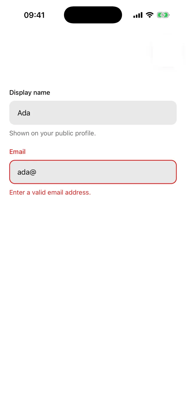
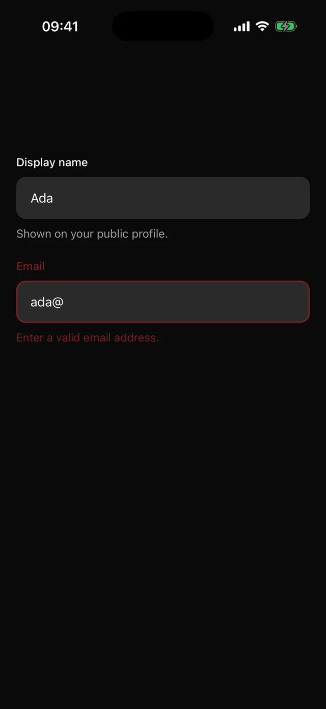
Label, control, description and error, wired for screen readers on both platforms.
npx @eoria/cli add fieldUsage
import {  Field,  FieldControl,  FieldDescription,  FieldError,  FieldLabel,} from '@/components/ui/field'
<Field invalid={submitted && !!error}>  <FieldLabel>Display name</FieldLabel>  <FieldControl>    <Input value={name} onChangeText={setName} />  </FieldControl>  <FieldDescription>Shown on your public profile.</FieldDescription>  <FieldError>{error}</FieldError></Field>
Parts
| Part | Role |
|---|---|
Field |
Owns invalid and disabled, generates ids with useId. |
FieldLabel |
A Label with the id, and shares its text for the control’s label. |
FieldControl |
Clones its single child with nativeID, accessibilityLabelledBy, accessibilityLabel, accessibilityHint, and invalid/disabled when set. |
FieldDescription |
Helper text, mirrored into the control’s hint. |
FieldError |
Renders only while invalid with a message, and announces it. |
useFieldControl() returns the same props for a custom control you do not want cloned.
Notes
accessibilityLabelledByis Android-only, so the label text is also passed asaccessibilityLabel. Any explicit label on the child wins.- React Native has no
describedBy. While invalid, the error text replaces the description in the control’s hint. - Works with any control that accepts those props: Input, Textarea, Checkbox, Switch, Select’s trigger.