Popper
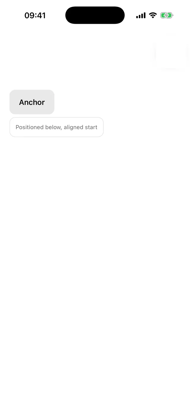
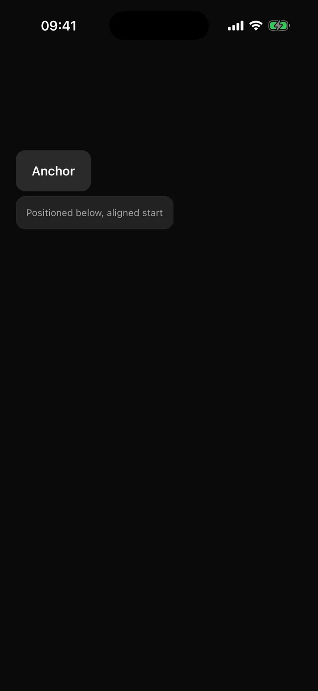
Anchored positioning. Measures a trigger, places content on a side, flips when it does not fit.
npx @eoria/cli add popperUsage
Popover, Tooltip, DropdownMenu and Select are built on it. Use it directly for a custom anchored layer.
import { Popper, PopperAnchor, PopperContent } from '@/components/ui/popper'
<Popper>  <PopperAnchor>    <Button onPress={() => setOpen(true)}>Anchor</Button>  </PopperAnchor>  {open ? (    <PopperContent side="bottom" align="start" onDismiss={() => setOpen(false)}>      {content}    </PopperContent>  ) : null}</Popper>
Props
| Prop | Values | Default |
|---|---|---|
side |
top, bottom, left, right |
bottom |
align |
start, center, end |
center |
sideOffset |
number | 6 |
alignOffset |
number | 0 |
matchAnchorWidth |
boolean | false |
onDismiss |
tap outside or Android back | |
modal |
hide the app from screen readers | false |
How it places
PopperContent measures the anchor in window coordinates, lays the content out invisibly in the portal to learn its size, then computes a position. If the requested side does not fit inside an 8pt margin and the opposite side does, it flips. The result is clamped to the window and converted to host coordinates. Then it fades in over 120 ms. Closing unmounts immediately.
withPressHandlers(child, handlers) is exported for asChild triggers. It calls the child’s own handler first, then yours.