Spinner
Indeterminate loading indicator with ring, dots and bars styles.
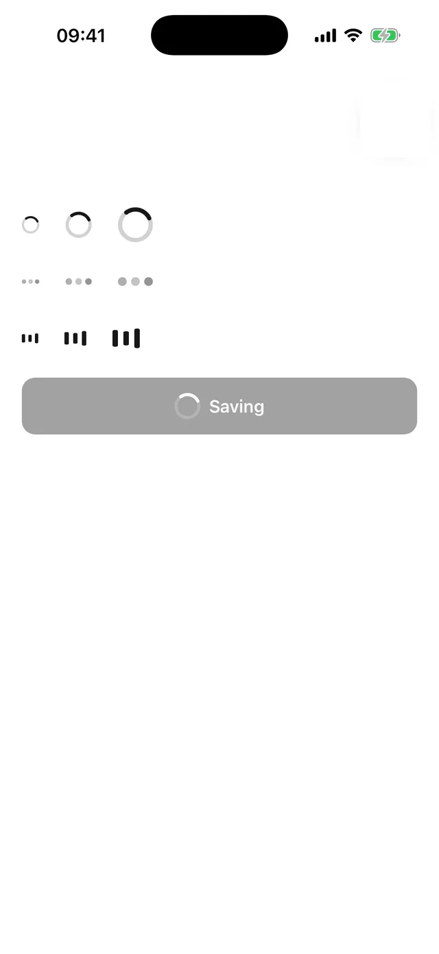
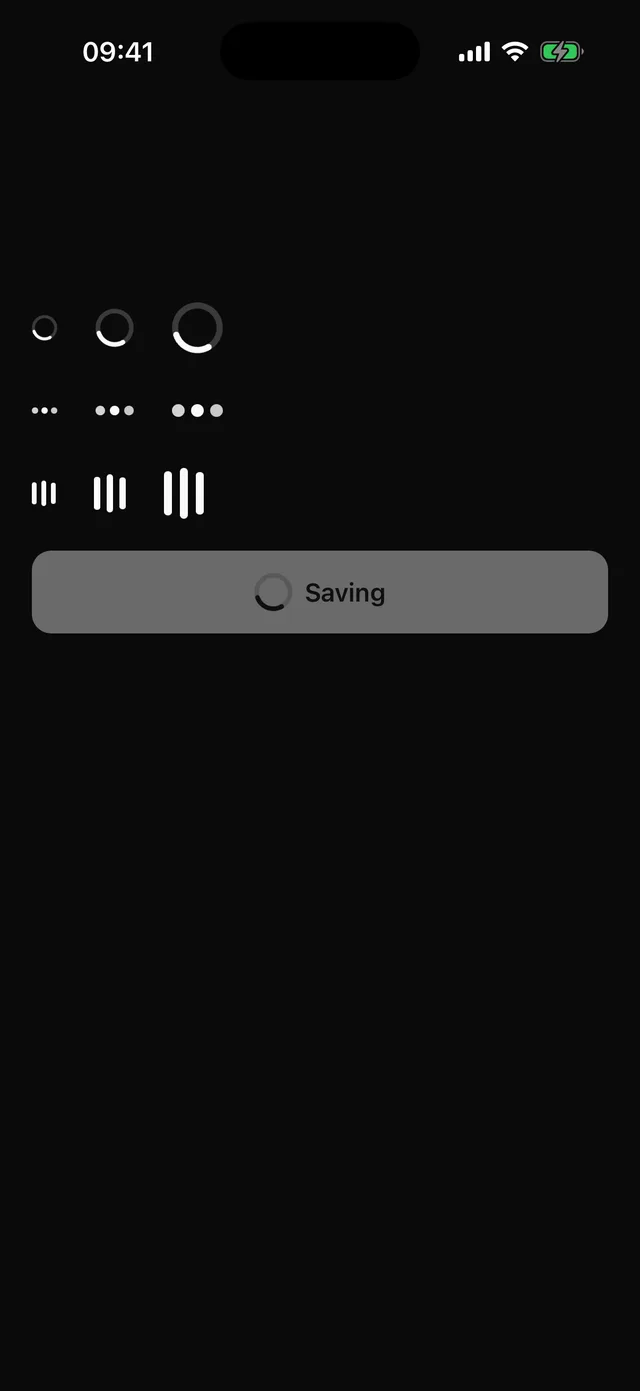
npx @eoria/cli add spinnerNeeds react-native-svg for the ring. Expo projects can add it with npx expo install react-native-svg; the CLI installs it as a dependency of the item.
Usage
import { Spinner } from '@/components/ui/spinner'
<Spinner /><Spinner variant="dots" size="sm" /><Spinner variant="bars" size="lg" accessibilityLabel="Uploading" /><Button disabled icon={<Spinner size="sm" color="white" />}>Saving</Button>
Props
| Prop | Values | Default |
|---|---|---|
variant |
ring, dots, bars |
ring |
size |
sm 16pt, md 24pt, lg 32pt |
md |
color |
any colour; overrides the recipe | primary |
accessibilityLabel |
announced text | Loading |
styles |
override indicator (width is the size, color the tint) |
Notes
ring is an SVG arc on a faint track, rotating once every 900 ms. dots fade three dots in sequence and bars pulse three bars in height, both on the same cycle. The root is a progressbar with busy state. Under the OS reduce-motion setting the shapes stop moving; the label still reports loading. Pass color when the spinner sits on a filled surface, for example primaryForeground inside a default Button.