Keyboard
Keep the focused field visible, pin an action above the keyboard, and move between fields.
npx @eoria/cli add keyboardNeeds react-native-keyboard-controller, a native module. Add it with npx expo install react-native-keyboard-controller, rebuild the development build, and wrap the app once:
import { KeyboardProvider } from 'react-native-keyboard-controller'
<KeyboardProvider>{/* app */}</KeyboardProvider>
Usage
import { KeyboardFooter, KeyboardScrollView, KeyboardToolbar } from '@/components/ui/keyboard'
const insets = useSafeAreaInsets()
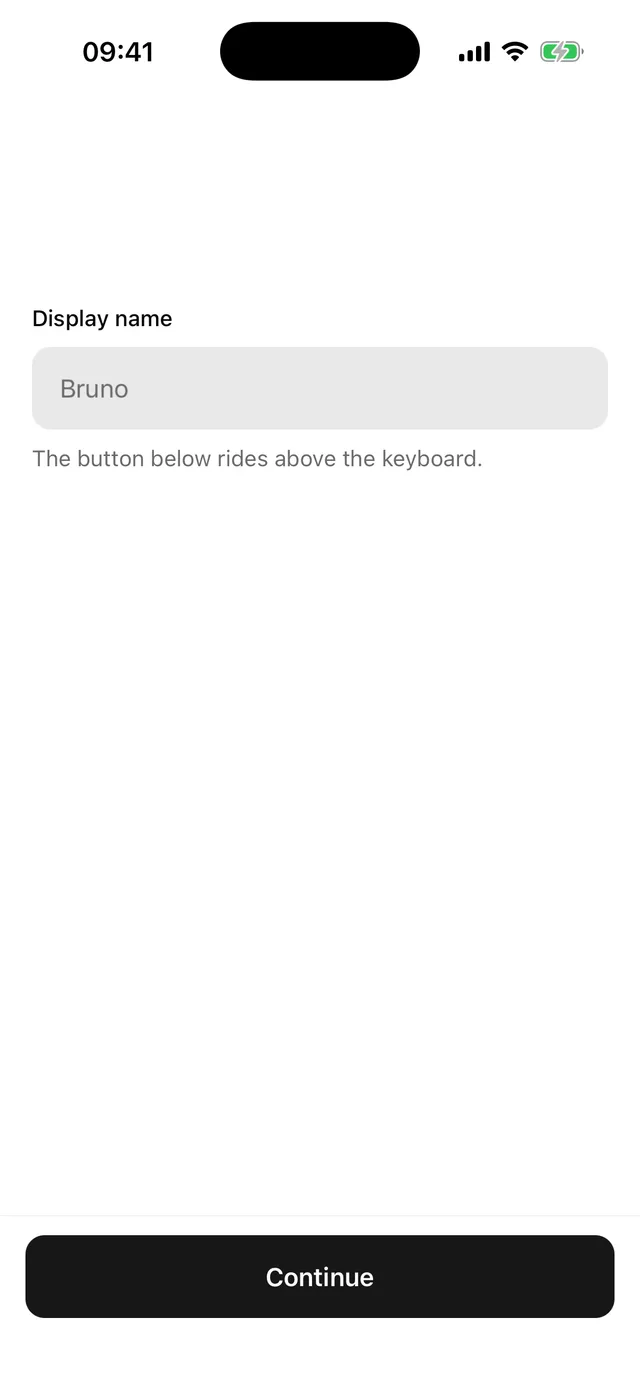
<>  <KeyboardScrollView contentContainerStyle={{ padding: 20, gap: 16 }}>    <Field>…</Field>    <Field>…</Field>  </KeyboardScrollView>  <KeyboardFooter variant="bordered" bottomInset={insets.bottom}>    <Button width="full">Continue</Button>  </KeyboardFooter></>
For a long form, add the toolbar once after the scroll view:
<KeyboardToolbar doneText="Done" />Props
| Part | Prop | Values | Default |
|---|---|---|---|
KeyboardScrollView |
bottomOffset |
gap kept between the focused field and the keyboard | theme.space[6] |
KeyboardScrollView |
every KeyboardAwareScrollView and ScrollView prop |
||
KeyboardFooter |
variant |
plain, bordered |
plain |
KeyboardFooter |
bottomInset |
bottom safe-area inset | 0 |
KeyboardFooter |
styles |
override root |
|
KeyboardToolbar |
every library toolbar prop except theme |
Notes
KeyboardAvoidingView from React Native resizes the screen and behaves differently on each platform. These parts move with the keyboard frame by frame on both, which is why they need the native module.
KeyboardFooter pads itself by bottomInset while the keyboard is closed and gives that space back once the keyboard covers the home indicator, so the button sits the same distance above either edge. It does not read the safe area itself, which keeps react-native-safe-area-context out of the item.
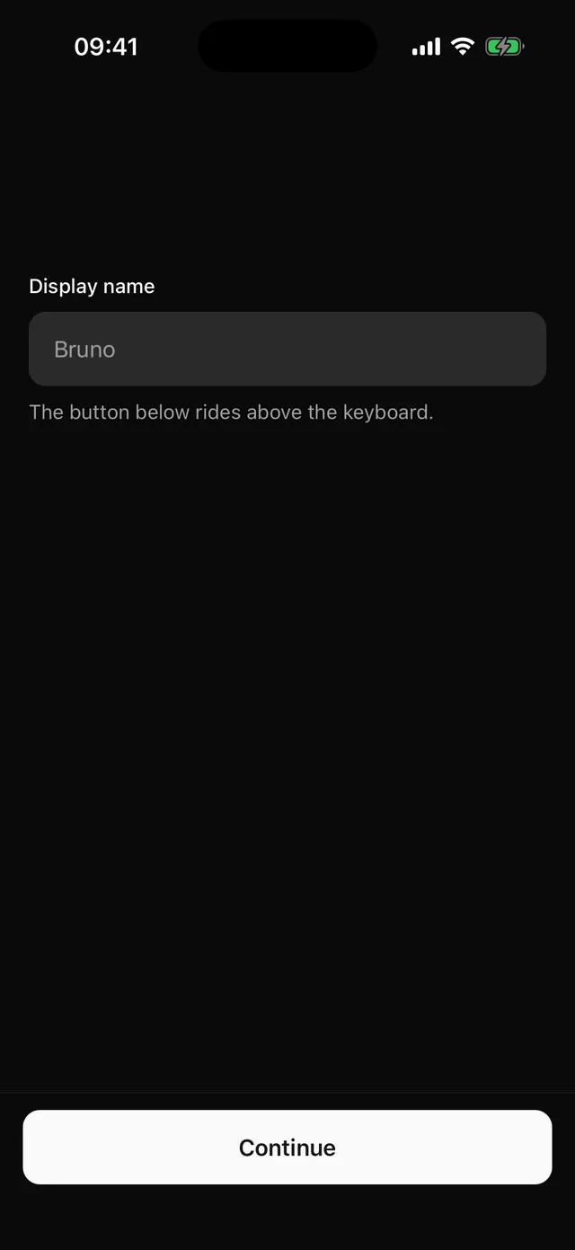
KeyboardToolbar takes its colours from the active theme, so it follows presets and dark mode. The arrows move focus between the text inputs on screen in the order they were mounted.