RadioGroup
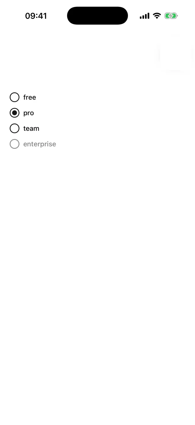
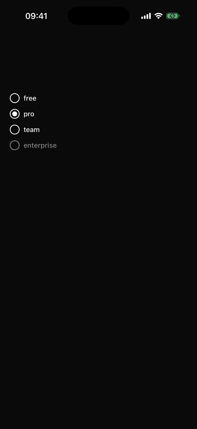
Single choice from a set of items, controlled or uncontrolled.
npx @eoria/cli add radio-groupUsage
import { RadioGroup, RadioGroupItem } from '@/components/ui/radio-group'
<RadioGroup value={plan} onValueChange={setPlan} accessibilityLabel="Plan">  {plans.map((p) => (    <HStack key={p} gap={2}>      <RadioGroupItem value={p} accessibilityLabel={p} />      <Label onPress={() => setPlan(p)}>{p}</Label>    </HStack>  ))}</RadioGroup>
Props
RadioGroup takes value, defaultValue, onValueChange and disabled, and renders a View with the radiogroup role. RadioGroupItem takes value, size (sm, md) and disabled, and reports checked in its accessibility state.
Layout is yours. The group does not impose a direction, which is why the checkout example can put each item in a row with a description and a price.