Avatar
Image with an initials fallback. Sizes and shapes.

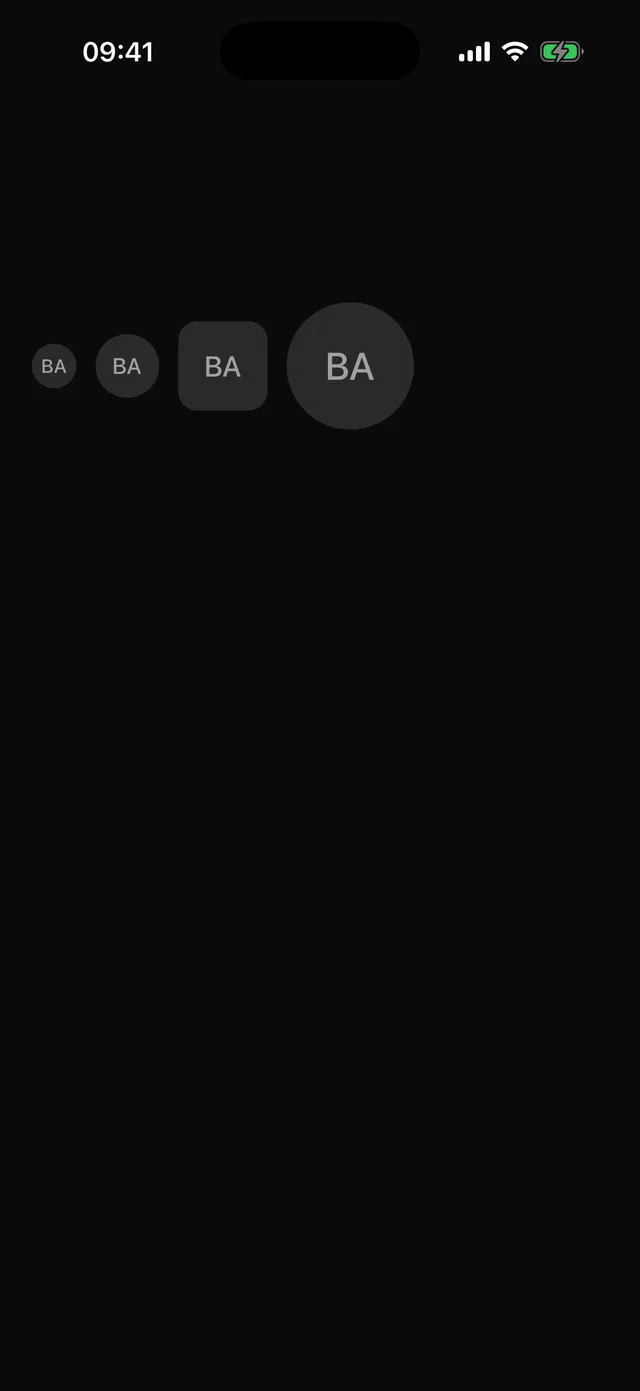
npx @eoria/cli add avatarUsage
import { Avatar, AvatarFallback, AvatarImage } from '@/components/ui/avatar'
<Avatar size="lg" accessibilityLabel="Ada Lovelace">  <AvatarImage source={{ uri }} />  <AvatarFallback>al</AvatarFallback></Avatar>
Variants
| Prop | Values | Default |
|---|---|---|
size |
sm 28, md 40, lg 56, xl 80 |
md |
shape |
circle, rounded |
circle |
Notes
The fallback shows until the image loads and stays if it fails. The image is mounted invisibly during load so the fallback stays centred. The initials are hidden from screen readers; the root carries the image role and your label.