Combobox
Searchable single-choice list. Options are filtered as you type; the list shrinks to stay above the keyboard.
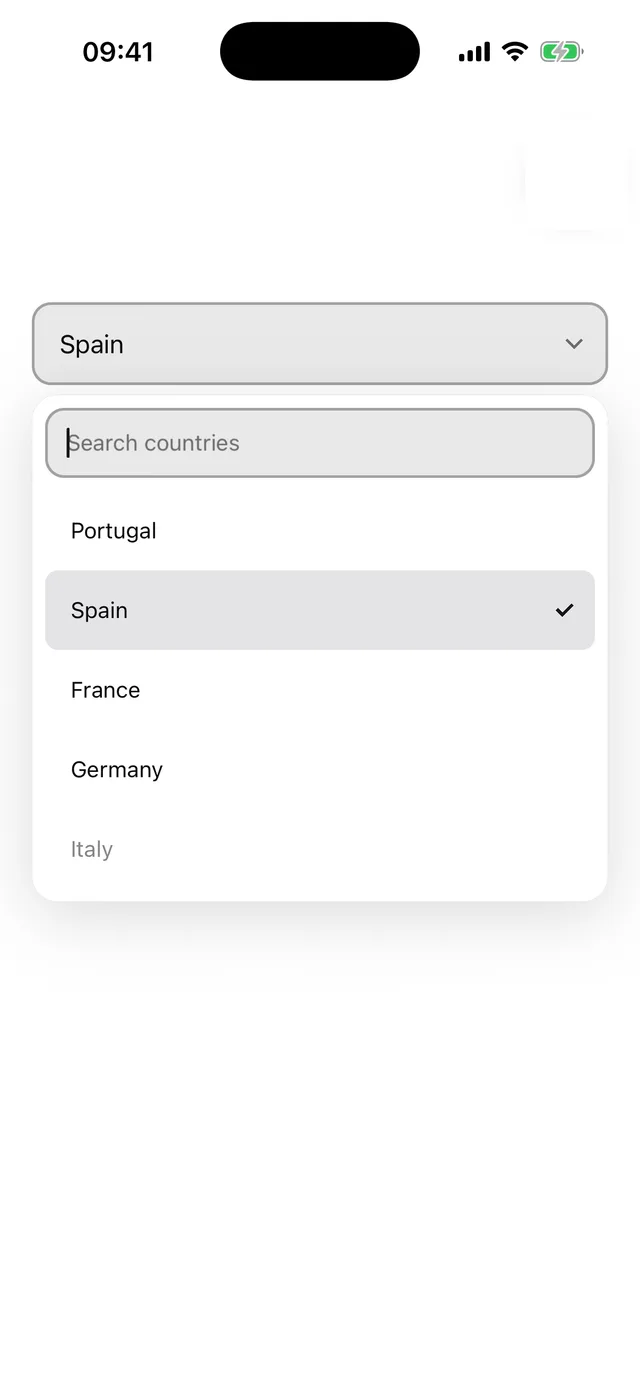
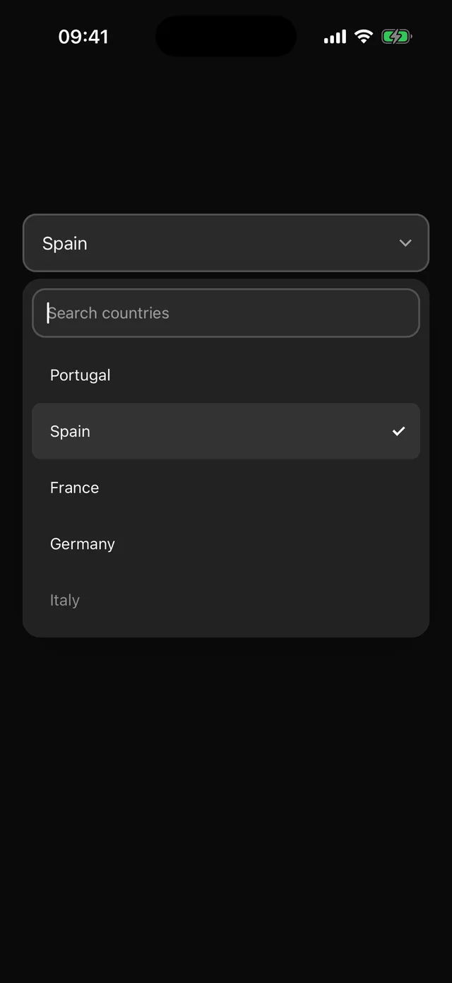
npx @eoria/cli add comboboxUsage
import { useState } from 'react'import { Combobox, ComboboxContent, ComboboxTrigger, type ComboboxOption } from '@/components/ui/combobox'
const countries: ComboboxOption[] = [  { value: 'pt', label: 'Portugal', keywords: ['lisbon'] },  { value: 'es', label: 'Spain', keywords: ['madrid'] },  { value: 'fr', label: 'France', disabled: true },]
export function CountryPicker() {  const [country, setCountry] = useState<string | undefined>()  return (    <Combobox options={countries} value={country} onValueChange={setCountry}>      <ComboboxTrigger placeholder="Choose a country" />      <ComboboxContent searchPlaceholder="Search countries" emptyText="No country found" />    </Combobox>  )}
Props
Combobox takes options, value, defaultValue, onValueChange(value, option), open, onOpenChange, filter, size (sm, md, lg), invalid and disabled. Unlike Select, the value is a plain string because the options are known up front; passing value={undefined} clears the selection, and the presence of the value key marks the component controlled.
ComboboxTrigger takes a placeholder or custom children. ComboboxContent takes searchPlaceholder, emptyText, renderOption(option, selected) for a custom row body, listProps for the underlying FlatList, closeLabel for the tap-outside layer (default Close), and the Popper placement props with align defaulting to start.
Each option has value, label, optional disabled and optional keywords. The default filter is a case- and accent-insensitive substring match over the label and keywords; pass filter to replace it. defaultComboboxFilter is exported if you want to extend it.
Notes
The recipe extends the Select recipe, so the trigger frame and rows follow any local edit to Select, and the two line up in a form. The search field takes focus when the list opens and clears when it closes. The list is 280pt at most and shrinks when the keyboard shows so rows stay reachable; on short screens with long lists a sheet is still the better presentation. The trigger has the combobox role and reports the selected label; rows use the option role.