Switch
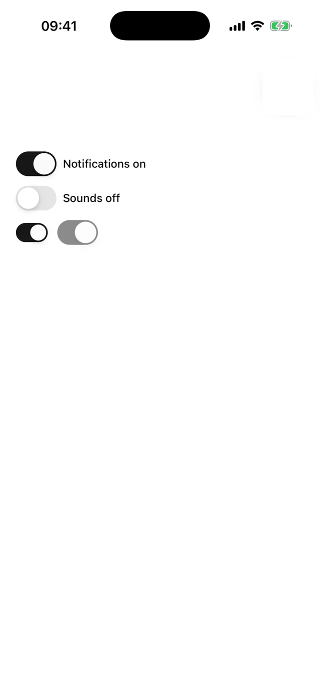
iOS-proportioned toggle.
npx @eoria/cli add switchUsage
import { Switch } from '@/components/ui/switch'
<Switch checked={push} onCheckedChange={setPush} accessibilityLabel="Push notifications" />
Props
| Prop | Values | Default |
|---|---|---|
checked |
boolean, required | |
onCheckedChange |
(checked: boolean) => void |
|
size |
sm 40x24, md 51x31 |
md |
disabled |
boolean |
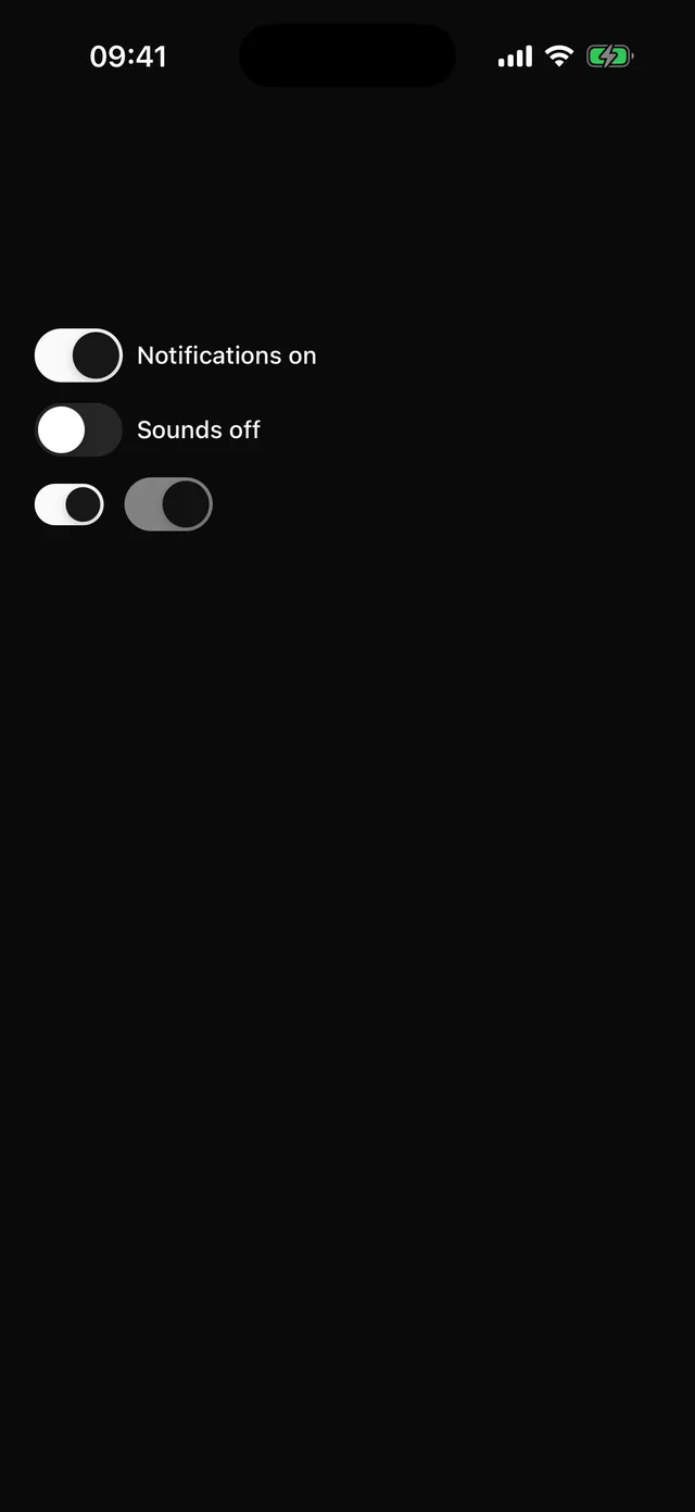
The thumb travel is computed from the recipe with getStyleValue, so resizing the track in an extension keeps the thumb aligned. The thumb takes primaryForeground when on, so it stays visible on light primaries in dark mode.