Settings screen
Grouped settings rows with links, switches and actions, a confirmed sign out and a version footer.
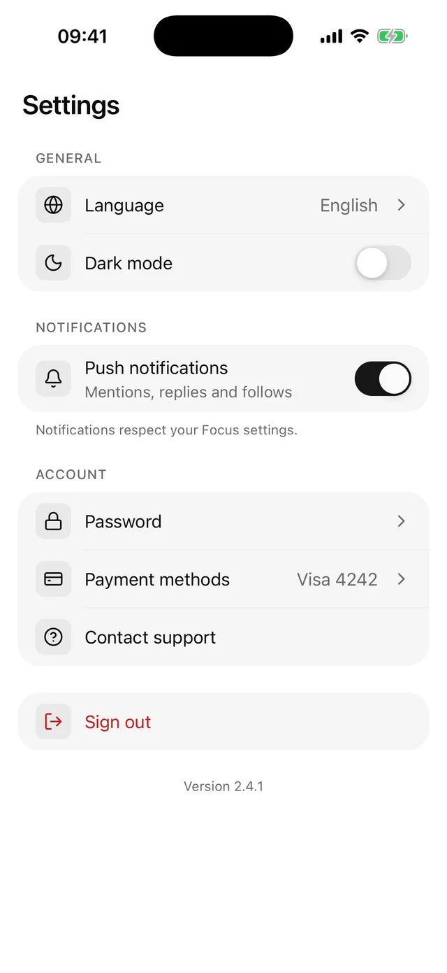
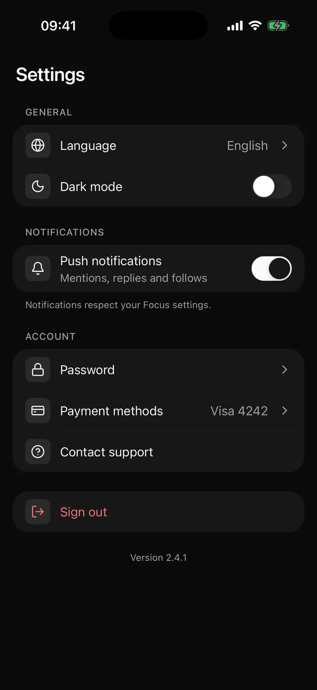
npx @eoria/cli add settings-screenThe command also adds Item, Switch, AlertDialog and Text.
Usage
import { Bell, Globe, HelpCircle } from 'lucide-react-native'import { SettingsScreen, type SettingsSection } from '@/components/blocks/settings-screen'
const [push, setPush] = useState(true)
const sections: SettingsSection[] = [  {    id: 'general',    label: 'General',    rows: [      {        kind: 'link',        id: 'language',        title: 'Language',        icon: <Globe />,        value: 'English',        onPress: openLanguage,      },    ],  },  {    id: 'notifications',    label: 'Notifications',    footer: 'Notifications respect your Focus settings.',    rows: [      {        kind: 'switch',        id: 'push',        title: 'Push notifications',        description: 'Mentions, replies and follows',        icon: <Bell />,        value: push,        onValueChange: setPush,      },      { kind: 'action', id: 'help', title: 'Contact support', icon: <HelpCircle />, onPress: openSupport },    ],  },]
<SettingsScreen title="Settings" version="2.4.1" sections={sections} onSignOut={signOut} />
Props
| Prop | Type | Default |
|---|---|---|
sections |
SettingsSection[] |
|
onSignOut |
() => void |
|
title |
string | |
version |
string | |
insetTop |
boolean | true |
style |
StyleProp<ViewStyle> |
Data
type SettingsSection = {  id: string  label?: string  footer?: string  rows: SettingsRow[]}
type SettingsRow =  | { kind: 'link'; value?: string; onPress: () => void }  | { kind: 'switch'; value: boolean; onValueChange: (value: boolean) => void }  | { kind: 'action'; destructive?: boolean; onPress: () => void }
// Every row also takes://   id: string//   title: string//   description?: string//   icon?: ReactElement   any element accepting `size` and `color`//   disabled?: boolean
Notes
- The block keeps no settings state. A switch row shows
valueand callsonValueChange, so the values live in your store. - “Sign out” opens an AlertDialog.
onSignOutruns only after the user confirms. Cancel, a tap on the overlay and Android back all close the alert without calling it. - A
linkrow is one button with a chevron. Aswitchrow is a plain row, so the Switch stays its own element for screen readers and takes the row title as its label. - The root is a
ScrollViewthat fills the screen, paintsbackgroundand pads the bottom by the safe area. Under a navigation header passinsetTop={false}and leavetitleout, because the header already does both jobs. - Change first: the copy of the alert, and the sign out row if your app needs “Delete account” next to it. Add it as an
actionrow withdestructive.