Sign in
Email and password screen with validation, a busy state, an error banner and optional Apple and Google buttons.
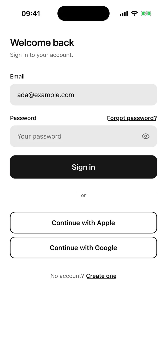
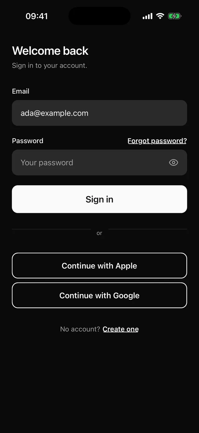
npx @eoria/cli add sign-inThe CLI also adds alert, button, field, input, keyboard, password-input, separator, stack and text. The file lands at components/blocks/sign-in.tsx and is yours to edit.
The form scrolls inside KeyboardScrollView, so the app needs KeyboardProvider at its root. The Keyboard page has the setup.
Usage
import { router } from 'expo-router'import { SignIn } from '@/components/blocks/sign-in'import { signIn } from '@/lib/auth'
export default function SignInRoute() {  return (    <SignIn      onSubmit={async ({ email, password }) => {        await signIn(email, password)        router.replace('/')      }}      onForgotPassword={() => router.push('/forgot-password')}      onSignUp={() => router.push('/sign-up')}    />  )}
The block has no navigation and no network code. Your route does both through the callbacks. If signIn throws, the block shows the error message in a destructive Alert above the form.
Props
| Prop | Type | Notes |
|---|---|---|
onSubmit |
(values: SignInValues) => void | Promise<void> |
Gets { email, password } once both fields pass. The email is trimmed. |
onForgotPassword |
() => void |
Renders the “Forgot password?” link beside the password label. |
onSignUp |
() => void |
Renders the “No account? Create one” line. |
onApple |
() => void |
Renders “Continue with Apple” under an “or” separator. |
onGoogle |
() => void |
Renders “Continue with Google” under the same separator. |
defaultValues |
Partial<SignInValues> |
Starting email and password. |
insetTop |
boolean |
Pads the top by the safe area. Pass insetTop={false} when the screen sits under a navigation header. Defaults to true. |
style |
StyleProp<ViewStyle> |
Merged into the root, after the block’s own styles. |
Notes
- Validation is two lines of plain state. The email must match
^[^\s@]+@[^\s@]+\.[^\s@]+$and the password needs 8 characters. Errors stay hidden until the first submit, then update as the user types. - When
onSubmitreturns a promise, the block setsloadingon the button until the promise settles. The button shows a spinner, ignores presses and keeps its colours. A second submit from the keyboard is ignored while one is pending. A rejection putserror.messagein the Alert and announces it to screen readers. The block skips state updates after it unmounts, so navigating away insideonSubmitis safe. - The return key on the email field moves focus to the password. The return key on the password submits.
- The root has
flex: 1, paintstheme.colors.backgroundand pads the bottom byrt.insets.bottom. It also pads the top byrt.insets.top, which suits a route with no header. PassinsetTop={false}when the screen sits under a navigation header, because the header already covers that space. The content column stops at 480pt wide on tablets. - The social buttons are plain outline buttons with no logos. Apple and Google both publish rules for their sign-in buttons, so check those before you ship.
- To use a form library, delete the
useStatecalls and the twoErrorconstants, read values and errors from the library, and keepField,FieldControlandFieldErroras they are.Fieldonly needsinvalidand a message. - Change the heading and the line under it first. They say “Welcome back” and “Sign in to your account.”